As the name suggests, the Mobile-First Approach in the product development process places design for mobile devices first, that is, before desktop devices. So instead of the conventional and relatively older approach of prioritizing design for desktops, the product development process begins with smaller screens first, gradually proceeding to bigger screens.
The Origin Of Mobile-First
In the product development process, we come across two major principles: Progressive Advancement and Graceful Degradation. Let’s talk about them one-by-one:
Progressive Advancement: This principle aligns well with the agile framework and focuses on smaller screens first and as you might have rightly guessed, forms the basis for the mobile-first approach within the product development process. Mobile design being the harder part, is completed first, followed by desktop design. This way, you have the heart of the user experience you need right in the beginning. Once the difficult mobile design questions have been answered, it is highly likely for the rest to fall in place.
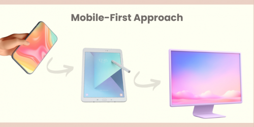
Graceful Degradation: Opposed to the principle of Progressive Advancement, the principle of Graceful Degradation is focused on designing for desktop devices first and then gracefully (if you are graceful enough) degrading to the “lower screens” (although it is difficult to call mobile screens the lower ones in the current scenario).
This approach, often less favored in the modern product development process which is more inclined towards an agile framework , can be a bit ironic. Here’s why. When you design for the bigger screens first, you build an all-inclusive design and there’s a high chance for the core and the more important elements to get mixed up with the supplementary and not-so-important elements. And then when you sit down to design for the mobile devices, it becomes a ruckus to segregate the two, complicating the product development process. Also, this approach needs you to somehow cut down on the user experience as you move from desktop to mobile, rendering the mobile design as a mere afterthought or a watered down version of the desktop design. Added to this is the inability of numerous web elements to adapt to mobile screens which degrades the quality and the overall experience of the mobile user.
Mobile-First and the Development Process
In the Product Development process, the Mobile-First approach primarily relates to the initial design and development stages.
Mobile devices come with inherent limitations such as smaller screen sizes and less powerful hardware compared to desktop computers. These limitations force designers to focus intensely on the most crucial aspects of content and functionality within the product development process. This constraint leads to the creation of streamlined and user-focused interfaces and experiences, which are essential for a successful mobile application in any comprehensive product development process.
This prioritization ensures that the most essential elements are defined clearly and early , setting a strong foundation for further stages in the product development process. It also helps in ensuring that the product is intuitive and easy to use from the get-go, which is vital in retaining user engagement.
Why Should You Care?
Mobile-First Approach isn’t just another buzzword. It is the need of the time. With more and more people spending an increased number of hours on their mobile devices,embracing a mobile-first strategy isn’t just keeping up with trends—it’s about setting your business up for sustained success within the product development process.

This approach goes far beyond shrinking your website to fit on a smaller screen. It’s about reimagining how your services reach your customers in the most direct and effective way possible by adapting a more agile framework. Let’s have a look at why this strategy is indispensable for various stakeholders:
- For Designers: Stepping into the mobile-first arena, designers must think small to achieve big in the product development process. This means prioritizing simplicity and functionality, crafting interfaces that are not just visually appealing but also intuitively usable across diverse devices. It’s about mastering the fine art of minimalistic design that doesn’t compromise on elegance, ensuring every swipe and tap seamlessly guides the user.
- For Product Managers: If you’re managing products, mobile-first means viewing your projects through a mobile lens from the get-go. This focus ensures that the features you develop are genuinely useful and enjoyable on smaller screens, thereby enhancing the overall user experience and satisfaction. It’s about foresight—anticipating how users will interact with your product on the go and embedding those insights into the product development process.
- For Developers: Developers in a mobile-first context need to prioritize efficiency and performance within the product development process. This involves writing clean, concise code and optimizing media to ensure the app or website loads quickly and runs smoothly on mobile devices. It’s about building from the ground up for speed and reliability, ensuring that users enjoy a frictionless experience whether they’re on a train, in a café, or lounging at home.
- For QA Testers: Quality assurance becomes even more stringent under a mobile-first strategy. Testers need to ensure that mobile applications perform impeccably across all platforms and under various conditions. This thorough testing is key to catching bugs early in the product development process, which not only saves time and resources but also protects your brand’s reputation by ensuring a polished end product.
- For Content Creators & Marketers: Mobile-first for marketers and content creators means being succinct and impactful. You’ll need to convey your message in ways that grab and hold attention on smaller screens, using engaging visuals and clear, compelling text. It’s about making every word and image count, optimizing for scroll-throughs and quick glances without losing the depth of your message.
- For Business Leaders: For executives, adopting a mobile-first strategy aligns your business with the reality of today’s consumer behavior. It ensures that you meet your customers where they are most likely to interact with your brand—on their mobile devices. This approach not only broadens your reach but also deepens engagement, driving sales and fostering loyalty.
- For SEO Specialists: SEO now goes hand-in-hand with mobile optimization. Search engines prioritize mobile-friendly websites, so ensuring a mobile-first approach in the product development process is crucial for improving your search rankings. It’s about ensuring that when customers search for services or products like yours, they find you—quickly and easily.
- For Clients/End Users: Ultimately, who benefits the most from all this effort? The users. They receive a seamless, enjoyable experience that feels both intuitive and engaging. A well-executed mobile-first approach in the product development process means that your audience can access your services effortlessly, making their interactions with your brand positive and memorable.
Now, let us also have a quick glance at some stats that reinforce the importance of a Mobile-First strategy in today’s mobile world:
- As per Statcounter Global Stats, overall mobile users continue to grow with a leading market share of 60.43% as compared to desktop users.
- As per Statcounter Global Stats, Mobile browsing was essentially equal to desktop browsing with each taking a 48% share in January 2021.
-
Perficient estimated that 61% of all U.S. web traffic originated from mobile devices in 2020.
- As per Smartphone Usage Statistics, smartphone users tend to spend an average of 3 hours and 15 minutes on their phones.
-
Smartphone Usage Statistics also revealed that millennials spend more than 5.7 hours on their smartphones per day. Moreover, people check their phones 58 times a day on average
Mobile First Design Vs. Responsive Design Vs. Adaptive Design
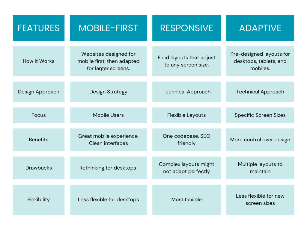
Imagine building a website. Traditionally, the product development process would start with the large desktop view. Mobile-first flips this on its head. It prioritizes mobile users by crafting a clean, user-friendly experience for the smallest screens. Large fonts, short sentences, and clear buttons are key. Then, like building blocks, extra content and features are added for larger screens.
A responsive design approach in the product development process tackles things differently. It uses a single website that adjusts its layout based on the device. Think of it like a flexible web page that can squeeze or stretch to fit any screen size. This requires careful planning to ensure everything looks good and functions flawlessly across devices.
Finally, adaptive design in the product development process creates entirely separate layouts for different device categories: mobile, tablet, and desktop. This offers a more customized experience but comes at the cost of extra work. Maintaining multiple layouts can be complex.
So, mobile-first is a design philosophy with a mobile-centric mindset, responsive design offers adaptable layouts with a single website, and adaptive design provides customized experiences through separate layouts.
The How of Mobile-First: A Step-by-Step Guide
When it comes to mobile-first approach, the screens might be smaller but the complexity level increases manifold. It is thus important to have a solid plan to ensure a smooth product development process. Here’s a step-by-step guide to help you with the same:
Step 1: Ask Yourself What You Want
Although simple-sounding, setting objectives and expectations from your mobile-first strategy is very, very important. What do you want to achieve from this approach? Improved user engagement? Increased sales from mobile devices? Enhanced mobile SEO? Whatever the answer or answers may be, it is important to ask these questions before you dive in.
Step 2: Design with a ‘Mobile Mind’
Make sure you begin the design process with the smallest screen in mind as part of your product development process. This way, you will be able to filter out the features which are of utmost importance and enable a focused user experience. Make sure the navigation is easy, simple and quick, as is preferred by mobile users. Optimize features such as form inputs, button sizes, and other interactive elements, for a smooth mobile experience. Also, incorporate features that are mobile-specific such as GPS, cameras, click-to-call button, etc. Use flexible layouts that adapt smoothly to different screen resolutions.
Step 3: Focus on Performance and Security
You don’t want your mobile users to keep waiting for your website to load. To avoid such a situation, make sure you implement techniques such as compression, minifying CSS/JavaScript, and leveraging browser caching to ensure high speed on mobile. Ensuring robust security measures are in place is also a fundamental aspect of the product development process, safeguarding user data and enhancing trust in your mobile application.
Step 4: Iteration is Key
It is highly unlikely that you end up developing the world’s best mobile site in one go. Instead, a more iterative and agile framework is the way to go. Once the initial design is ready, test it on various devices. Check for compatibility. Check for performance. Use both manual and automated testing so that you are able to cover varied user scenarios. Once you have launched the mobile site, make sure you continuously collect user feedback and act on it. This is the best way to find the areas for improvement and make substantial changes. A flexible and iterative product development process is key here. Make sure you make changes as needed- regularly look for feedback and act on it, be aware of new design trends and you are good to go.
Step 5: Measuring Success
Once everything is done, keep a close eye on important metrics such as bounce rate, conversion rate, session lengths, traffic sources, etc. Use analytics and a data-driven approach to measure the success of your mobile-first strategy.
The How of Mobile-First: An Example
Let us try to understand how the Mobile-First approach in the product development process looks like with the example of a coffee shop website.

You run a coffee shop called the Bean Haven.
For the mobile design, think about what the user might be looking for. They want quick, accessible and actionable information on their mobile. This includes the address, hours open, and your contact info. Since it is a mobile device, adding a ‘Call Us’ button is a must.
This way, you have all the essential information prioritized and on display. At the same time, you can insert a ‘hamburger menu’ at, say, the top left corner, enabling the user to explore your website further in case they wish to do so.
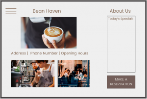
Now envision the same website but on a tablet. Here, the user probably has more time to explore the website and you get relatively more space to display the website contents.
Consider adding more images to make the website visually appealing and maybe add a ‘Make a Reservation’ button.

On a desktop, you have an even bigger canvas to experiment with. Feel free to add images- images of your coffee shop, the ambiance, your menu items, etc.
Insert a ‘Make a Reservation’ form. Maybe add a button asking users to subscribe to your newsletter? The address, contact info and the opening hours remain constant.On the top right corner, you can add the About section besides some others like Blogs, Reviews and Careers.
This example helps understand what it looks like when you design for different devices and how you can ensure a successful product development process when you start with the smallest screen first with the most essential features on display, followed by larger screens with add-on elements.
Now let’s have a look at some real-life examples of the mobile-first approach.
Getting Some Inspiration
Think mobile-first might be your thing after all? Let’s get you some inspiration. Here are 5 real-world examples of great mobile design to get that inspiration kicking in:
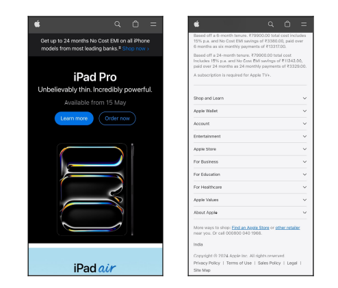
1. Apple:
- Easily scroll down to access information- eliminating the need for navigation button.
- Shopping icon very prominently placed.
- Get information in the bottom navigation once you’ve scrolled the page
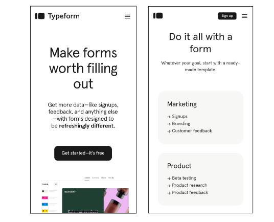
 2. Typeform:
- The desktop website is visually very attractive with animations and relatively complex design elements
- However, for mobile design, things were kept simple to manage load times
- A Clean, simplified and readable mobile design
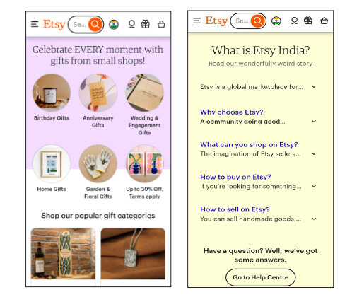
 3. Etsy:
- Most important elements are placed on the home page in a readable and simple manner: search bar; popular products; product categories
- Large clickable images- suitable for touchscreen
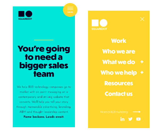
 4. Squaredot:
- Simple yet engaging
- Perfect colors, fonts and interactive elements
- A large clickable menu that expands beautifully
Best Practices
It’s important to know what the best practices are for adopting a mobile-first approach in the product development process in order to ensure that you end up with a functional and adaptive design:
- Simplicity is the Best Policy
The more complex the mobile design is, the more perplexed your users might get. A simple design, with all the core functionalities, is the best design for mobile. - Prioritize, Prioritize and Prioritize
In the limitless ocean of information, go fishing and hunt down the most important fish, that is, the most important information that the user will definitely look for. Keep adding to this list in decreasing order of importance. Voila! You have a content hierarchy for your mobile design and soon, an amazing mobile design too! - Keep the Touch in Mind
When you design for mobile, you design for touchscreen. Tightly spaced, miniature elements must be avoided and large icons and clickable buttons should be incorporated in the mobile design. - Go Visual
Up your visuals game. Include animations, color and other visual cues to the user to enhance the overall experience. - Be Prepared for Offline
There are chances that your mobile user might lose connection in the middle. For situations such as these, make sure you allow your users to continue with their tasks online such that the changes are visible once they’re back online.
Here’s Your Toolkit
Now that you are familiar with the Mobile-First Approach in the product development process, let’s get you started with the right set of tools:
- Google’s Mobile-Friendly Test:
This free Google tool helps you assess how mobile-friendly your current website is. It checks for responsiveness, loading time, and mobile device usability. With this tool, you can ensure that your website offers a positive experience for mobile users as you get a score and improvement suggestions. - Adaptive Images:
Your website may load more slowly with large graphics, particularly on mobile devices with data-constrained plans. With the usage of Adaptive Images, your website may recognize the size of the user’s screen and present the proper image size automatically. This enhances mobile device user experience and website loading speed. - WordPress Themes:
WordPress is a common website creation platform. Numerous WordPress themes—pre-made layouts—are responsive to mobile devices. This saves you from having to write any code at all to design a website that looks great on mobile devices. A wide range of design options are offered by both paid and free themes. - Gator Website Builder:
Gator Website Builder is an excellent choice if you’re searching for an easy-to-use method of creating a website without knowing any code. It provides pre-made templates, many of them are made to be responsive on mobile devices. This implies that the website layout adapts to various screen sizes automatically, making sure it seems great on desktop, tablet, and mobile devices. - Bootstrap:
A free and open-source framework for creating websites is called Bootstrap. It offers a selection of pre-made elements and styles that facilitate the creation of responsive websites more quickly and easily. With Bootstrap, the design is optimized for mobile devices first, then resized for larger screens, following the mobile-first methodology. This guarantees that your website works and looks great across all platforms.
CTA- If you want to , schedule a call or write to us at hi@logicloom.in:
- No more squeezing your website into a tiny screen! Build mobile-first with us. Schedule a call or write to us at hi@logicloom.in
- Think mobile-first, win users first. Schedule a call or write to us at hi@logicloom.in
- Lead the small screen, win big dreams. Kickstart your mobile-first strategy by reaching out to us at hi@logicloom.in
References
Desktop vs Mobile Market Share Worldwide | Statcounter Global Stats. (n.d.). StatCounter
Global Stats.
URL: https://gs.statcounter.com/platform-market-share/desktop-mobile/worldwide
Desktop vs Mobile vs Tablet Market Share United States Of America | Statcounter Global Stats. (n.d.). StatCounter Global Stats.
URL: https://gs.statcounter.com/platform-market-share/desktop-mobile-tablet/united-states-of-america
Free Photo | 3d rendering of hand holding phone. (2023, September 30). Freepik.
URL: https://www.freepik.com/free-ai-image/3d-rendering-hand-holding-phone_72619669.htm#query=3d%20phone&position=11&from_view=keyword&track=ais_user&uuid=8dd32cf1-fb97-4fb2-95d0-08504f8fbf74
Free PSD | Tablet mock up design. (2017, March 21). Freepik.
URL: https://www.freepik.com/free-psd/tablet-mock-up-design_1076502.htm#fromView=search&page=1&position=5&uuid=98bfd239-21b1-4808-9c13-78a9f1637a39
Free PSD | Modern tv screen isolated. (2024, April 18). Freepik.
URL: https://www.freepik.com/free-psd/modern-tv-screen-isolated_178845053.htm#fromView=search&page=1&position=45&uuid=4517447a-d62d-4080-a296-296d3669e950
How much time does the average person spend on their phone? (n.d.). KommandoTech.
URL: https://kommandotech.com/statistics/how-much-time-does-the-average-person-spend-on-their-phone/
Mobile vs. Desktop Usage in 2020. (n.d.). Perficient.
URL: https://www.perficient.com/insights/research-hub/mobile-vs-desktop-usage-study

