Role of UI/UX in the Mobile App Development Process

Picture yourself thrilled to try a new app you’ve just downloaded. You launch it, filled with anticipation, ready to dive into its features and discover how it might make your day a bit easier or more enjoyable. However, your excitement quickly turns to frustration. You find yourself navigating through a maze of menus to find simple functions, squinting at tiny text, and struggling to perform even the most basic tasks. Feeling let down, you uninstall the app and look elsewhere.

This frustrating experience is far from unique. In fact, research reveals that an overwhelming 77% of users abandon an app within the first three days of use. The usual suspect? Poor user experience (UX) and user interface (UI) design are often to blame.
But there’s hope! This guide is your entry into the essential world of UI/UX design for mobile apps. So read on to know how you can create a mobile app that users not only download but truly enjoy and keep using.

What is UX?

User Experience, or UX, revolves around the complete journey that users undertake while engaging with your app—from their first interaction to the lasting impression it leaves. Imagine a UX designer as a kind and wise guide who meticulously designs the pathway through your app, ensuring that every step is effortless, logical, and enjoyable.

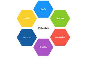
Let’s take a look at the Peter Morville’s UX Honeycomb which enlists seven interconnected aspects, each vital for nurturing a delightful user experience:


  • Usable: Is the app simple to use? Do users feel like everything is just where it should be, making tasks straightforward and navigation intuitive?
  • Useful: Does the app fill a real need in users’ lives? Does it offer unique solutions that users couldn’t easily find elsewhere?
  • Desirable: Is the app a joy to look at and interact with? Does its design invite users in and make them feel at home?
  • Accessible: Can anyone, regardless of their physical abilities, use the app effectively? Are there thoughtful accommodations for users with different accessibility needs?
  • Credible: Does the app earn the users’ trust? Are their personal data and privacy securely protected?
  • Findable: How easy is it for users to come across your app in a sea of competitors? Is it clearly labeled and described so that it stands out in the app store?
  • Valuable: Do the features and services provided by the app genuinely improve users’ lives? Is there a compelling reason for them to keep coming back?

By weaving these seven elements together, your app becomes more than just a tool; it transforms into an experience that users cherish and connect with emotionally, encouraging them to stay engaged and spread the word.

What is UI?

UI design is what transforms your app from a bare-bones framework into something that feels like a part of everyday life—beautiful, functional, and incredibly user-friendly.Colors, fonts, buttons, and icons—these elements are more than just decoration. They’re the thoughtful touches that UI designers use to craft spaces that are not just easy to navigate but also inviting. This approach makes the app not just a tool, but a comfortable, intuitive extension of our daily routines.

UX and UI: What’s the difference?

It’s easy to tell apart UX and UI from each other. 

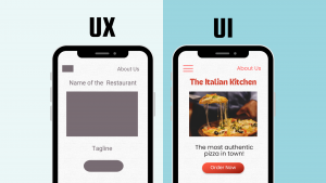
Think of UX as the brain behind everything, while the UI is the face. UX focuses on what users want to do and makes things enjoyable and easy for them. UI, on the other hand, designs the screens you see and makes them beautiful, clear and visually appealing.

If UX is the architect, UI is the interior designer.

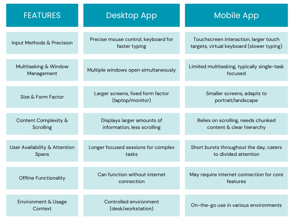
Desktop Vs. Mobile App: How the UX Differs

It’s easy to tell apart UX and UI from each other. 

Think of UX as the brain behind everything, while the UI is the face. UX focuses on what users want to do and makes things enjoyable and easy for them. UI, on the other hand, designs the screens you see and makes them beautiful, clear and visually appealing.

If UX is the architect, UI is the interior designer.

Why UI/UX Design Matters in Mobile App Development

First Impression Matters (a lot)

In today’s cutthroat app market, making a strong first impression is crucial. It all comes down to having an interface that’s not only easy on the eyes but also user-friendly, with smooth navigation. Just picture this: if an app seems outdated or hard to figure out within the first few seconds, chances are users will ditch it and go for a rival app instead.

User Experience = User Engagement

When a user-friendly app is well-designed, it can predict what users need and deliver a smooth, hassle-free experience. This leads to happy users who are more likely to spend time using your app, keep coming back, and even recommend it to others.

For example, think about a social media app with a slow and clunky interface. It’s frustrating for users and makes them spend less time browsing through content. On the flip side, an app with a fast and user-friendly interface encourages users to spend more time browsing and engaging with the content.

Make It Effortless

Good navigation is key to a great user experience. No one wants to waste time trying to figure out how to do something in an app. A well-designed interface with easy-to-understand menus, labels, and icons helps users reach their goals smoothly, reducing frustration and saving time.

Sell Better

Whether e-commerce or just app monetization, apps today are trying to sell something to their users. A well-thought-out UI/UX design strategically places those buttons that prompt action and smoothly leads users through the process of making a purchase. When you create a great user experience, you’re more likely to turn app users into paying customers.

Take, for instance, an e-commerce app with a messy product page and a checkout process that’s just plain confusing. Chances are, users will feel frustrated and might give up on buying anything. On the flip side, an app with clear product details, top-notch images, and a straightforward checkout process with secure payment options would motivate users to complete their purchases and even spend a little more while they’re at it.

Reduced Costs 

Investing in good design from the start might seem like spending extra money, but it can actually help you save money in the future. A well-made app that’s easy to use means you need to fix fewer problems and make fewer changes after it’s launched. Plus, when users like your app, they ask for help less often, which means you spend less.

Brand Image

A user-friendly app creates a positive image of your brand in the minds of users while a poorly designed app with confusing navigation or a cluttered interface can greatly damage brand perception. Good UI/UX design that prioritizes usability and aesthetics positions you as a company that cares about user experience.

Thinking Big

A well-designed app with a focus on scalability allows for future growth and feature additions.It allows for new functionalities to be seamlessly integrated. This adaptability is crucial for keeping your app relevant and competitive in the ever-evolving mobile landscape.

The ‘How’ of UI/UX Design for Mobile Apps: Step-by-Step

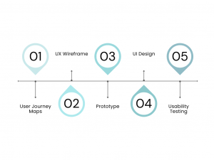
Step 1: Mapping User Journeys

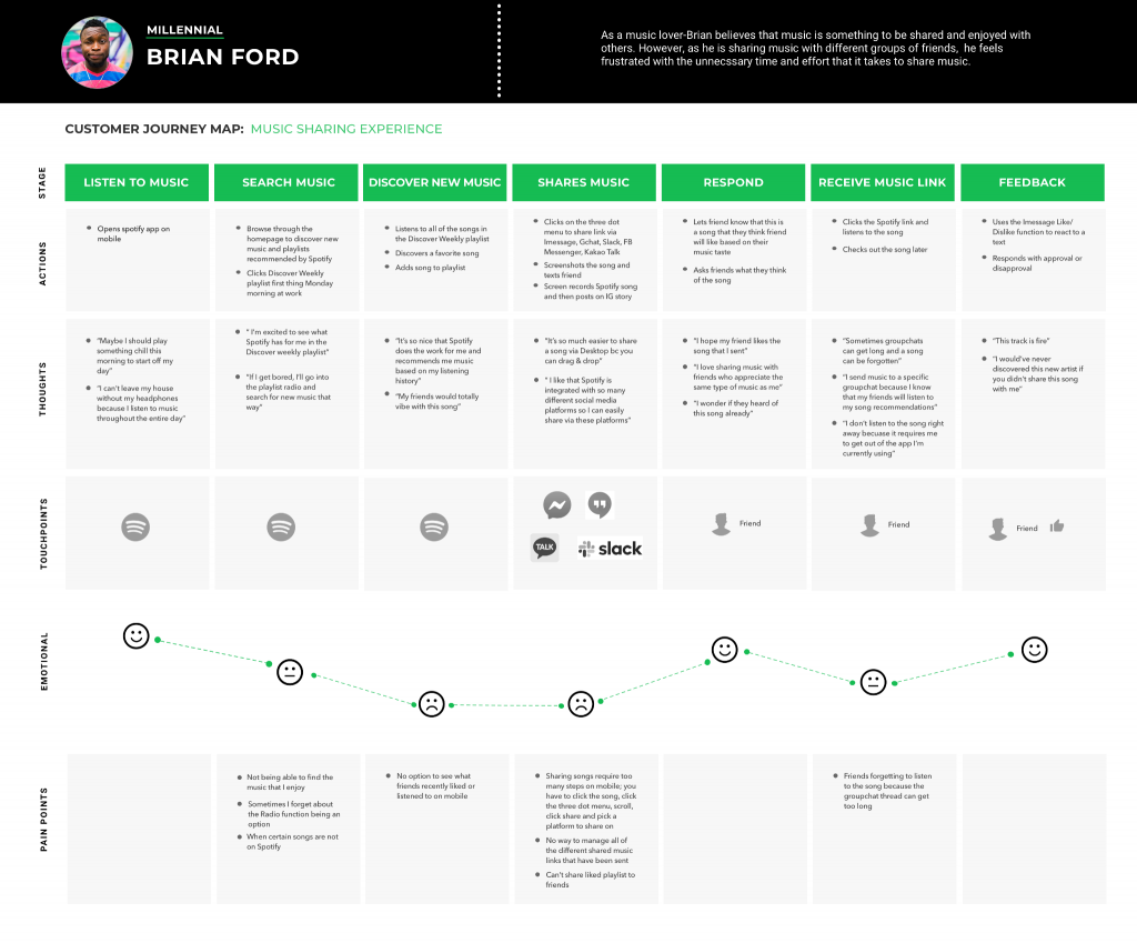
Just like a roadmap helps you navigate a physical journey, a user journey map guides you through the twists and turns of user experience with your app. By plotting out each step, you can spot where things might get bumpy, figure out what users are hoping for, and shape your app to meet those needs. 

Here is what a customer journey map looks like for a user’s music sharing experience within Spotify:

Source: Sharon Kim


Wondering how to do it? Here’s the answer:

Create User Personas

A user persona is like crafting a character for a story, but in this case, it’s a fictional representation of your target audience. Think about the demographics, behaviors, goals, and the challenges your ideal user faces. This deep understanding allows you to customize your user journey map to cater to their specific needs.

Look for Key User Journeys

Recognize that not every user travels the same path through your app. Pinpoint the essential user journeys that capture the most critical actions users take within your app. This could range from “booking a ride” for a ride-hailing app to “completing a purchase” for an e-commerce platform.

Map all Touchpoints

Imagine your app as a series of handshakes with your users. From the first glimpse in the app store to the final checkout, every interaction counts. These may include  app store listing, onboarding screens, product pages,  checkout flow, and even customer support interactions .

Understand your User

At each touchpoint, try to get into the user’s shoes. What are they trying to do? What’s on their mind as they click through your app? Are they excited, frustrated, or somewhere in between? Understanding their feelings and thoughts helps you design an app experience that truly resonates.

Identify Pain Points and Opportunities

Think of pain points as potholes in the user’s journey – annoying bumps that slow them down. By spotting these obstacles – whether it’s confusing menus or a buggy checkout process – you uncover golden opportunities to make your app shine brighter.

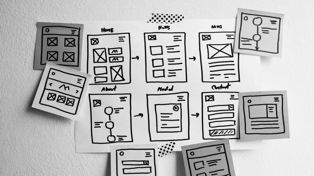
Step 2: Building UX Wireframe

Source: Springboard


Set the Canvas 

Consider the end platform—mobile, web, or desktop—and select a canvas size that matches its screen resolution. For mobile, decide between portrait or landscape orientation based on usage. For web and desktop, aim for flexibility while keeping common screen resolutions in mind. The canvas size should align with your desired user experience and platform.

Create a Basic Structure

Chalk out your design using boxes or rectangles to represent key UI elements: a header at the top, navigation bar below it, content area as the main rectangle, and a footer at the bottom. This establishes the layout and hierarchy.

Place Your Content Right

Use  placeholder text and shapes to show where images, videos, and text blocks will go. Consider readability and text length limits for a smooth user experience

Interactive Elements

Use clear labels and basic shapes to represent interactive elements like buttons and dropdown menus in your wireframes. Consider using arrows to indicate interactions that flow between screens.

Microinteractions

Use simple annotations or visual cues within your static wireframe to represent complex interactions like hover effects or state changes, such as a button becoming disabled.

User Annotations

Add brief notes or labels to explain specific content details within the wireframe. This can be helpful for understanding the purpose of each element.

Consistency is Key

Ensure a consistent visual language throughout your wireframes. Use the same kind of shapes and styles for similar elements across different screens to establish a sense of familiarity for users.

Do it Differently for Different Devices

When designing wireframes for multiple devices like mobile and desktop, prioritize crucial elements on each screen according to user needs and context of use. This ensures a tailored experience for users across different devices.

Interested in knowing how to figure out design for multiple devices? Read here. (link to Mobile-First Approach ebook)

Hick’s Law

Hick’s Law, or the Hick-Hyman Law, is a design principle that suggests the time taken for a person to make a decision increases with the number and complexity of choices available. Essentially, the more options a person has, the longer it takes for them to decide. For instance, when you’re presented with a simple search bar on Amazon, it allows for quick input and reduces the number of initial choices. This application of Hick’s Law helps users find what they need more efficiently.

The Goal Gradient Effect

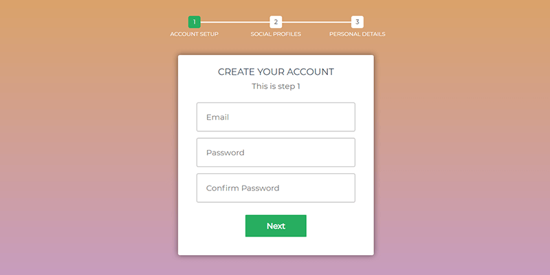
The Goal Gradient Effect states that our motivation to achieve a goal increases as we progress closer to its completion. It’s similar to the surge of energy a runner feels when nearing the finish line. In UX design, this effect can be utilized to enhance user engagement and motivation. For example, in an online signup process with a progress bar, as users advance and see their progress, the Goal Gradient Effect encourages them to complete the remaining steps.

Source: ByPeople

Fitt’s Law

Fitts’ Law, a principle in human-computer interaction (HCI), predicts the time it takes for a user to move a cursor or pointer to a target on a screen based on two factors: distance to the target and size of the target:

  • Distance to the Target: The farther a target is, the longer it takes to reach it. For instance, tapping a button in the corner of a phone screen requires more time and effort than tapping a button in the center.
  • Size of the Target: Larger targets are easier to select. Our motor skills make it simpler to hit a larger target than a smaller one.

For example, Spotify’s prominent play button at the center of the bottom navigation bar follows Fitts’ Law. Its larger size makes it easier to target, especially on mobile devices, reducing the risk of accidentally tapping the wrong button while aiming to play a song.

Miller’s Law

Miller’s Law suggests that the average person can hold around 7 (give or take 2) pieces of information in their short-term memory at once. 

Google’s search results page is a great example of this principle in action. It prioritizes the most relevant results at the top, presenting each with a concise title, snippet, and URL. This allows users to quickly scan and identify potentially useful pages without feeling overwhelmed. Additionally, Google often includes featured snippets or knowledge panels directly on the search results page, further reducing cognitive load and aiding comprehension.

Step 3: Prototyping

Think of UX wireframes as the blueprint for your app—they lay down the foundation, but they’re static. That’s where prototyping steps in. Prototypes are like the live version of your design, adding that interactive element to your wireframes. They allow users to actually experience the flow of your app, testing out its core features and how everything works together. It’s like turning your design into a playable demo, making it easier to fine-tune and perfect before the final product goes live.

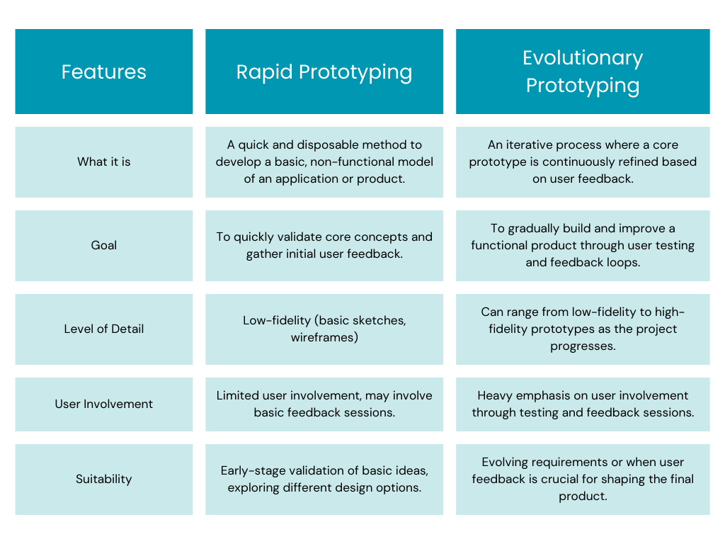
Within the world of prototyping, there are two main approaches to consider: rapid prototyping and evolutionary prototyping:

Wondering how a prototype differs from an MVP and a POC? Read our detailed blog here.

Step 4: UI Design

Effective UI design principles ensure your app is not only aesthetically pleasing but also intuitive and user-friendly. Here are some of the most important UI design principles to consider:

Clarity & Simplicity:

Keep your design clear and uncluttered. Users should be able to instantly understand the app’s purpose and core functionalities.

The popular social media platform Instagram prioritizes clarity with a clean interface. The focus is on user-generated content (photos and videos) with minimal UI elements that don’t distract from the core experience.

Consistency & Familiarity:

Maintain consistency in visual style, layout, and interaction patterns throughout the app. Leverage familiar design elements (icons, buttons) to minimize the learning curve for users.

The ride-hailing app Uber maintains consistency across its platform. The same icons and functionalities are used consistently across different regions and device types, ensuring a familiar experience for users everywhere.

Visual Hierarchy & Balance:

Guide users’ attention through the app using visual hierarchy. Prioritize important elements with size, color, and placement. Maintain visual balance for a pleasing aesthetic.

The e-commerce giant Amazon utilizes visual hierarchy effectively. Product images and titles are prominent, while less crucial information like filters and sorting options are positioned with less emphasis, guiding users towards product discovery.

User Control & Feedback:

Empower users with control over their experience. Provide clear feedback mechanisms to acknowledge user actions and interactions.

The photo editing app Adobe Lightroom Mobile offers users granular control over photo adjustments. Sliders and editing tools are readily accessible, and the app provides real-time previews to reflect editing choices, giving users full control over the creative process.

Structure Principle

Organize the UI elements in a meaningful and purposeful way. Related elements should be grouped together, unrelated elements should be separated, and visual cues should be used to differentiate between different functionalities.

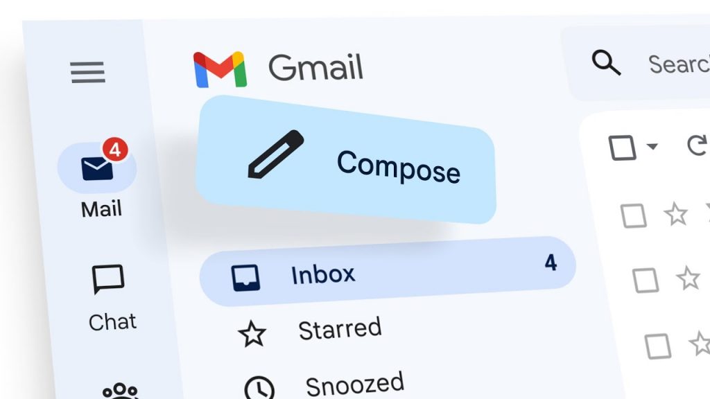
The email app Gmail embodies the Structure Principle. Emails are threaded by conversation, important actions like “Compose” and “Reply” are prominently placed, and folders and labels are categorized logically, creating a well-structured interface that helps users manage their inbox efficiently.


Source:The Keyword


Accessibility & Inclusivity:

Design your app to be accessible to a diverse range of users, including those with visual impairments, motor limitations, or cognitive differences.

The video-sharing platform YouTube prioritizes accessibility. Closed captions and audio descriptions are available for videos, and the interface can be adjusted for different color contrast needs, ensuring an inclusive experience for all users.

Step 5:Usability Testing

Usability testing involves observing real users interact with your app and identifying any potential roadblocks that hinder their experience.  Here’re some tools to get you started:

1.  Screen Recording Tools

Capture video recordings of user sessions, allowing you to observe how users navigate the app, interact with elements, and complete tasks.

  • Lookback.io: Offers screen and webcam recording with user feedback tools.
  • UserTesting: Provides screen recording with audio narration from users.
  • UXCam: Captures screen recordings along with heatmaps and analytics data.

2. Remote Testing Platforms

Users can interact with your app from their own devices while you observe and collect data.

  • UserTesting: Offers a platform for recruiting testers, conducting remote sessions, and analyzing results.
  • UserZoom: Provides a suite of tools for remote usability testing, including live observation and moderation.
  • TryMyUI: Another platform for remote usability testing with features like screener surveys and task management.

3. User Feedback Tools:

Gather qualitative data from users after they interact with your app. They can include surveys, polls, and in-app feedback mechanisms.

  • SurveyMonkey: Create surveys to gather user feedback on specific aspects of your app.
  • Typeform: Design engaging and interactive surveys to capture user insights.
  • Hotjar: Offers features like heatmaps, screen recordings, and surveys to understand user behavior.

4. Eye-Tracking Software:

Tracks users’ eye movements as they interact with the app, revealing which elements capture their attention and where they might be experiencing confusion.

  • Tobii Pro
  • SMI (SensoMotoric Instruments)
  • Gorilla (by Cleverley Solutions)

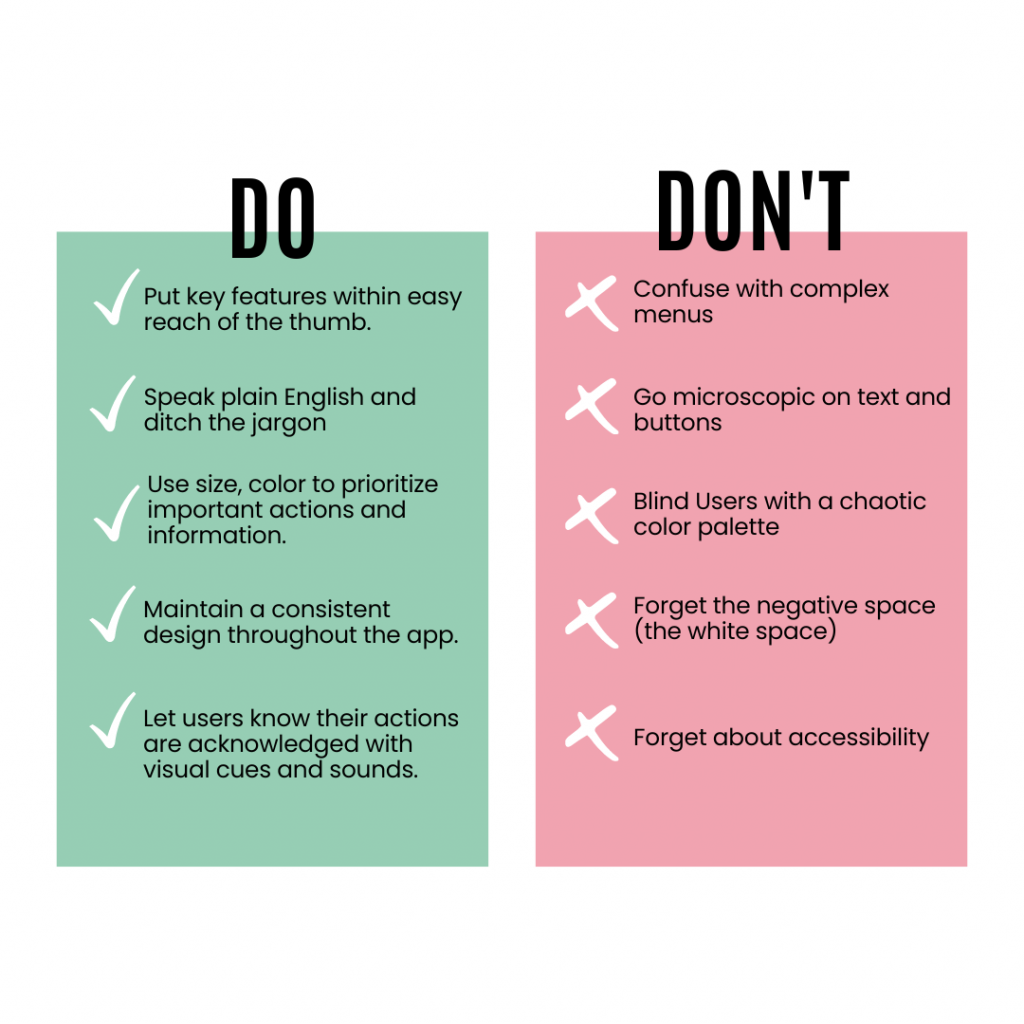
The Do’s and Don’ts of Mobile App UI/UX

Trends to Watch Out for in 2024

Voice User Interfaces (VUIs) 

Gone are the days of endlessly tapping through menus. Voice User Interfaces (VUIs) are becoming increasingly sophisticated, allowing users to interact with apps using natural language and enabling a hands-free experience. 

Imagine that you’re running late for work and craving your usual caffeine fix. With the Starbucks app’s voice ordering feature powered by Siri or Google Assistant, you can simply say “Hey Siri, order me a grande caramel macchiato at the nearest Starbucks with my usual customizations” and your order will be placed without needing to open the app or type a single word. Fast, convenient, and perfect for busy mornings!

Source: The Wall Street Journal


Augmented Reality (AR)

AR is transforming how we interact with the digital world. Ever wished you could see how a new couch or bookshelf would look in your living room before you buy it? The IKEA Place app leverages AR to address this very concern. Using your smartphone camera, the app allows you to virtually place IKEA furniture models in your space, letting you visualize scale, style, and fit before making a purchase. This AR-powered feature eliminates the guesswork and uncertainty associated with online furniture shopping, making the decision-making process smoother and more confident.

Source: Architect Magazine


Microinteractions

Microinteractions are tiny animations and feedback cues that acknowledge user actions and guide them through the app’s functionalities. 

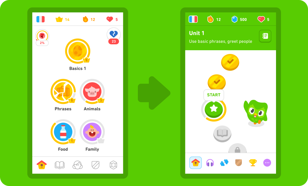
Learning a new language can feel daunting, but Duolingo’s gamified approach makes it engaging and fun. The app incorporates delightful microinteractions throughout the learning process. For example, completing a lesson is rewarded with a satisfying animation and encouraging messages. Duolingo also uses microinteractions to highlight correct answers and gently nudge users towards the right response if they make a mistake. These subtle cues keep users motivated and provide a sense of accomplishment as they progress through their language learning journey.

Source: Duolingo Blog


Neomorphism and Glassmorphism

Neomorphism utilizes soft shadows and subtle 3D effects to create a sense of depth and dimension, offering a clean and modern aesthetic. 

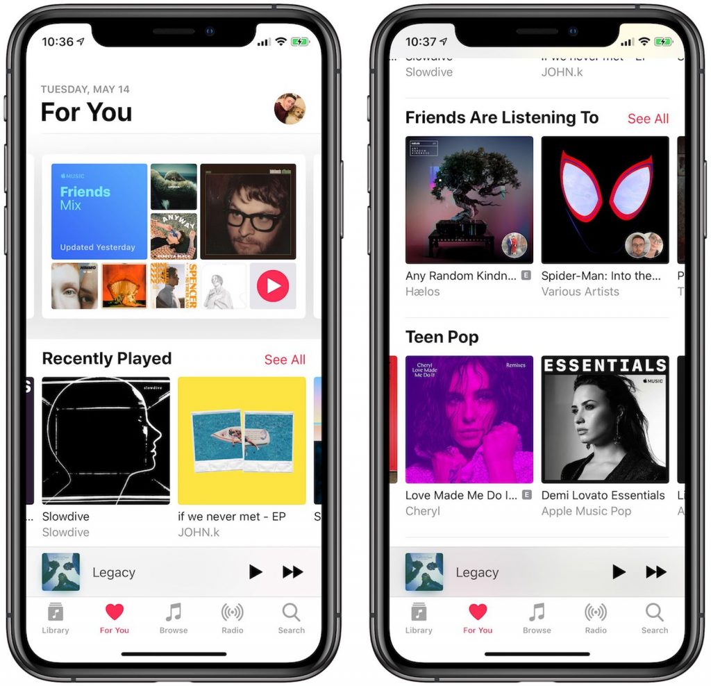
Apple Music embraces neomorphism with its clean interface and use of subtle shadows. Buttons and UI elements appear slightly raised, offering a sense of depth without looking overly complex. This design approach complements the app’s focus on music discovery and playback, creating a visually appealing and user-friendly experience.


Source: MacRumors


Glassmorphism, on the other hand, emphasizes transparency and blurred elements, resulting in a lighter and more ethereal feel.

Spotify leans towards glassmorphism with its use of translucent elements and blurred backgrounds. This approach creates a lighter and more modern feel, allowing album covers and other visual content to take center stage. The subtle transparency also helps maintain a sense of hierarchy within the interface, ensuring important information remains clear and easy to access.

Source: Dribbble

Excited about your mobile app design? Kickstart your UI/UX journey today by reaching out to us at hi@logicloom.in

Upgrading Your Mobile App: The Key to Enhanced User Experience

Mobile apps are our reliable sidekicks for deep consumer connections in the fast-paced digital world of today. To keep up with the trends, businesses need to give these apps a little glow-up now and then. Our blog is your cool guide, spilling the beans on why it’s awesome to upgrade apps regularly. No tech jargon here—just practical advice and a laid-back, tech-flexible plan to keep things smooth. We’ll also show you how these upgrades aren’t just about fancy tech stuff—they’re the secret sauce for super cool user experiences. It’s not just an upgrade; it’s a strategic move that puts businesses ahead in the digital game.

As a mobile app publisher, there are several reasons why you should regularly upgrade your app:
  1. Improved User Experience:  The process of upgrading your app holds the key to a transformative improvement in user experience. It entails the incorporation of valuable user feedback, a meticulous addressing of usability concerns, and an overarching enhancement of the overall user journey. This journey involves a constant evolution in the app’s interface, ensuring it remains not only visually appealing but also intuitively navigable. Concurrently, performance optimization becomes a central focus, aiming to reduce loading times, boost responsiveness, and create an app environment that operates seamlessly. Beyond this, the inclusion of new and refined features adds layers to the user experience, creating a dynamic and engaging interaction. The essence lies in the continuous commitment to refining and elevating the app, making each upgrade a step toward keeping users not just engaged but thoroughly satisfied with the app’s evolving capabilities. 
  2. Bug Fixes and Security: Picture this scenario: your app encounters bugs, crashes, or security vulnerabilities. Regular upgrades serve as your superhero, swiftly swooping in to fix these issues. By promptly addressing bugs, crashes, and security vulnerabilities, you not only ensure a stable and secure app experience for your users but also become their reliable guardian in the digital realm. This proactive approach not only boosts user confidence in your app but also plays a pivotal role in maintaining a positive reputation. Users appreciate an app that prioritizes their security and offers a seamless experience, creating a strong foundation of trust. In the ever-evolving digital landscape, being the superhero that safeguards users from digital perils adds a layer of assurance that goes a long way in establishing and upholding your app’s positive image. 
  3. Compatibility with OS and Devices: In the ever-evolving landscape of technology, staying in tune with the latest operating system (OS) updates and the emergence of new devices is imperative. Regularly upgrading your app is the key to maintaining compatibility with the most recent OS versions and the specifications of the latest devices entering the market. By doing so, your app becomes versatile and adaptable, ensuring a seamless user experience across a diverse range of devices and operating systems. This adaptability not only broadens your app’s reach to a larger audience but also enables you to harness the innovative capabilities and features introduced by the updated platforms. In essence, upgrading your app becomes a strategic move to align with the dynamic technological ecosystem, enhancing accessibility and optimizing performance for a wider user base.  
  4. Stay Competitive: In the dynamic landscape of the app market, staying competitive is paramount. The industry witnesses a constant influx of new apps and updates, creating a competitive environment. Regularly upgrading your app becomes a strategic necessity to remain relevant and hold your ground in the market. This involves not just fixing bugs or improving performance but also introducing new and innovative features. By embracing emerging technologies and aligning with market trends, you not only attract new users but also retain your existing user base. The ability to adapt, evolve, and offer something novel ensures that your app stands out in the competitive market, fostering user engagement and loyalty. It’s a proactive approach that positions your app as a dynamic player, ready to meet the evolving demands of users and the industry.  
  5. Performance Optimization: Consider your mobile app’s journey through the digital landscape. As users interact, the growing volume of user activity and accumulated data can impact performance, akin to a car needing a tune-up after a long drive. This is where Performance Optimization steps in. Regularly upgrading your app is like giving it that crucial tune-up, involving fine-tuning processes to enhance overall performance. It addresses bottlenecks, streamlines processes for quicker loading times, and ensures swift responses to user interactions.Picture the frustration of users dealing with a sluggish app—long loading times, unresponsive interfaces, and an overall lackluster experience. Upgrading your app not only counters these issues but also enhances the user experience, like upgrading a car’s engine for a smoother ride. By optimizing performance, you create a seamless, enjoyable, and responsive environment for users, ensuring every interaction is a delight. In essence, performance optimization is the secret sauce keeping your app running smoothly in the fast-paced digital race.
Determining the optimum frequency for app upgrades depends on various factors, including:
  1. User Feedback and Needs: Diving into the intricacies of user feedback and needs, it’s crucial to meticulously observe and analyze the input your users provide. Actively listen to their feedback, take note of any feature requests they express, and pay attention to the pain points they encounter while using your application. If a consistent pattern emerges where users are repeatedly requesting specific enhancements or reporting significant issues, consider it a clear signal that prioritizing an upgrade is not only beneficial but also imperative. This proactive approach ensures that your app aligns closely with user expectations and evolves to address their needs effectively. By staying attuned to user feedback, you not only enhance the overall user experience but also demonstrate a commitment to meeting the evolving demands and desires of your user base.  
  2. Industry and Market Trends: To remain at the forefront of the competitive landscape, it’s crucial to stay vigilant and well-informed about industry and market trends. This involves keeping a keen eye on emerging technologies and understanding evolving user expectations. Regularly updating your app becomes imperative in a dynamic environment where advancements occur frequently. If there are industry trends or new features that align seamlessly with your app’s goals, embracing them through more frequent upgrades becomes a strategic move. This ensures that your app not only stays relevant but also gains a competitive advantage by incorporating cutting-edge elements that resonate with your target audience. The key lies in adaptability and responsiveness to the ever-changing dynamics of your industry, allowing your app to evolve in tandem with emerging trends. 
  3. Complexity of Upgrades:
    The complexity of upgrades demands thoughtful consideration of their scope and scale. When dealing with smaller, incremental updates, the advantage lies in the ability to release them more frequently. These bite-sized updates can swiftly address specific issues or introduce minor enhancements without causing significant disruptions. On the other hand, larger feature releases or substantial architectural changes carry a different dynamic. Their intricate nature and broader impact necessitate more extensive development cycles. These major upgrades require meticulous planning, rigorous testing, and careful implementation to ensure a seamless transition and prevent any potential disruptions to the user experience. Striking the right balance between the frequency of smaller updates and the comprehensive approach to major upgrades is pivotal in maintaining a robust and evolving software ecosystem.  
  4. App Stability and Performance:
    Ensuring the stability and optimal performance of your app is a continuous and crucial task. Regularly monitor its performance metrics and stability to identify any issues that may affect the user experience. If you detect significant problems or encounter critical security vulnerabilities during your assessments, it becomes imperative to prioritize an app upgrade promptly. Timely upgrades are instrumental in addressing these concerns, preventing potential disruptions, and safeguarding the app’s reliability and security. By staying proactive in monitoring and addressing performance issues, you contribute to creating a seamless and secure user experience, instilling confidence in your app’s dependability.
Here are the general technical steps involved in upgrading a mobile app:
  1.  Requirement Analysis : Requirement Analysis is the foundational phase where we pinpoint the app’s specific needs and objectives for the upgrade. This involves a thorough examination of bug fixes, feature enhancements, performance improvements, and security updates. To kick off this stage, collaborative efforts gather crucial feedback from end-users, shedding light on pain points, usability concerns, and desired features. In parallel, involving stakeholders like project managers ensures alignment with organizational goals. This feedback loop, enriched by app analytics, provides quantitative insights into user behavior and preferences. The blend of qualitative and quantitative data guides the upgrade’s scope, addressing immediate needs and enhancing features. Requirement Analysis lays the groundwork for planning and execution, ensuring the upgraded app resonates effectively with users. 
  2. Planning and Design: In the Planning and Design phase, the groundwork for a successful app upgrade is meticulously laid out through a strategic approach. This phase kicks off with the creation of a comprehensive plan, serving as a roadmap for the entire upgrade process. Tasks are outlined, realistic timelines are established, and necessary resources are identified. A crucial consideration is the dynamic technology landscape, ensuring compatibility with various operating system versions, diverse device screen sizes, and maintaining backward compatibility. Simultaneously, the design aspect is equally critical, envisioning architectural and user interface changes for a seamless transition. Careful consideration is given to crafting changes that enhance the overall user experience, making the upgrade user-friendly. This user-centric approach is pivotal in retaining the user base while introducing enhancements. Through a thorough Planning and Design phase, the groundwork is laid for subsequent technical implementation, aligning the upgrade with strategic objectives and user expectations. 
  3. Code Refactoring and Optimization: The step of Code Refactoring and Optimization is a critical phase in the process of upgrading a mobile app. It involves a meticulous review of the existing codebase to identify areas that may need improvement. If necessary, the code is refactored, a process that involves restructuring the code without altering its external behavior. This restructuring aims to enhance the code’s readability, maintainability, and overall efficiency. Redundant or deprecated code is systematically removed to streamline the application and eliminate unnecessary complexities. Furthermore, the optimization aspect of this step focuses on enhancing the app’s performance. This includes refining algorithms, reducing memory usage, and improving the overall structure of the code to make it more efficient and responsive. Adherence to coding best practices is paramount during this phase to ensure that the upgraded codebase is not only optimized for the present but also maintains its scalability and ease of maintenance in the future. This meticulous attention to the codebase sets the foundation for a more robust and efficient mobile application. 
  4. Bug Fixing: The Bug Fixing stage in the mobile app upgrade process is a critical juncture dedicated to ensuring the app’s optimal performance and user satisfaction. This phase commences by meticulously addressing reported bugs and errors, a task that involves a comprehensive testing regimen. Thorough testing is conducted to scrutinize every aspect of the app’s functionality, with a keen focus on identifying and rectifying issues that may impede its smooth operation. This encompasses troubleshooting problems related to crashes, ensuring stability under varying conditions, enhancing responsiveness to user interactions, and ensuring compatibility across an array of devices and platforms. The goal is not only to eliminate existing bugs but also to preemptively identify potential issues that might arise in diverse usage scenarios. By meticulously resolving bugs and fortifying the app against potential pitfalls, developers lay the groundwork for a seamless and reliable user experience, reinforcing the app’s stability and performance across the ever-expanding landscape of devices and platforms. 
  5. Feature Implementation: Feature Implementation is a pivotal phase in the mobile app upgrade process, where the focus shifts to enhancing the app’s functionalities in alignment with the identified requirements. This involves a strategic blend of introducing novel features and refining existing ones to elevate the overall user experience. A modular approach is adopted, ensuring that these new functionalities seamlessly integrate into the existing app structure without causing disruptions to the core architecture. This modular methodology is crucial in maintaining the app’s stability and scalability. The introduction of new features is not merely an addition but a careful orchestration to ensure compatibility with other app components. This involves intricate testing to validate that the new features harmonize with the existing functionalities and do not compromise the app’s overall performance. The goal is not only to meet the upgrade requirements but to do so in a way that enriches the app’s capabilities, providing users with an enhanced and cohesive experience. This phase requires a balance between innovation and integration, ensuring that the upgraded app remains cohesive, user-friendly, and aligned with the evolving needs and expectations of its user base. 
  6. Data Migration and Storage: In the realm of mobile app upgrades, the phase of Data Migration and Storage holds paramount importance, especially when alterations to the app’s data storage or structure are on the agenda. Careful planning and execution are the keystones of this process. The first crucial step involves backing up the existing data meticulously, ensuring that no valuable information is lost during the transition. Following this, the execution of necessary data transformations takes place. This may involve restructuring databases, updating data formats, or making other adjustments to align with the upgraded version’s requirements. The overarching goal is to facilitate a seamless transition to the upgraded version, minimizing any disruptions or data inconsistencies that could arise during the migration process. This phase is critical in maintaining data integrity and ensuring that the upgraded app not only introduces new features or improvements but also retains and effectively manages the existing data in a manner that aligns with the app’s evolving architecture. The success of the Data Migration and Storage phase contributes significantly to the overall success and stability of the upgraded mobile app. 
  7. Integration Testing: Integration testing is a critical phase in the mobile app upgrade process, focusing on ensuring the seamless cohesion of various components. This comprehensive testing is designed to validate not only the functionality and performance of the upgraded app but also its compatibility across a diverse array of devices, screen resolutions, and operating system versions. The objective is to simulate real-world usage scenarios, uncover potential issues, and guarantee a consistent user experience across different environments. By testing on a variety of devices, the development team aims to identify and address any device-specific challenges that may arise. Moreover, screen resolutions are scrutinized to ensure that the app’s interface adapts appropriately to varying display sizes. Operating system versions are also a crucial consideration to ascertain that the app remains robust and error-free across different iterations. Integration testing goes beyond the app itself, encompassing external services, APIs, and dependencies. The goal is to verify that these elements collaborate seamlessly with the upgraded app, minimizing the risk of disruptions and ensuring the continued reliability of interconnected functionalities. This meticulous testing phase is instrumental in identifying and resolving potential integration issues, contributing to the overall success of the app upgrade. 
  8. Security Assessment: The Security Assessment phase is a critical aspect of the mobile app upgrade process, focusing on fortifying the app against potential threats and vulnerabilities. In this stage, a comprehensive review of the existing security measures is undertaken, and enhancements are implemented to address any identified weaknesses. This involves the timely application of necessary security patches, ensuring that the app is shielded against known vulnerabilities and exploits. Penetration testing is a key component of this phase, where the app undergoes simulated attacks to identify potential risks and weak points in its defenses. The goal is to proactively identify and mitigate any security loopholes that could be exploited by malicious actors. Additionally, compliance with relevant data protection and privacy regulations is ensured, aligning the app’s security practices with the legal and ethical standards governing the handling of user data. By prioritizing security in this phase, the upgraded app not only safeguards user information but also builds trust by demonstrating a commitment to robust data protection practices. 
  9. Beta Testing and User Acceptance Testing: Beta Testing and User Acceptance Testing are critical phases in the mobile app upgrade process. Beta Testing involves releasing the upgraded app to a select group of users, encouraging them to provide feedback on usability, performance, and encountered issues. This real-world trial helps uncover glitches and diverse user scenarios. User Acceptance Testing (UAT) assesses whether the app meets user expectations and business requirements. Users evaluate the app against predefined criteria, ensuring an improved experience. Feedback from both phases is invaluable, guiding developers in refining the app for a successful and well-received final release that aligns with user expectations. 
  10.  Deployment and Rollout: The Deployment and Rollout phase is the pivotal moment when the upgraded app transitions from development to real-world application. It involves packaging the changes into a version update release package and submitting it to app stores like the Apple App Store and Google Play Store for review. Coordinating the rollout strategically times the release, minimizing disruptions and ensuring a smooth transition for users. This phase is crucial for aligning with platform standards, managing server loads, and communicating changes effectively to users, marking the bridge between development efforts and user engagement. 
  11.  Post-Release Monitoring and Support: After the upgraded app takes its place in the digital realm, our focus shifts to the critical phase of Post-Release Monitoring and Support. This entails vigilant tracking of the app’s performance, user feedback, and analytics to ensure a smooth user experience. Swift attention is given to any reported issues or bugs, emphasizing prompt resolutions to maintain the app’s reliability. Simultaneously, a continuous support system is in place, providing ongoing assistance and updates. This proactive approach not only enhances user satisfaction but also solidifies confidence in our commitment to delivering a top-notch app experience. 

Conclusion  

Upgrade your mobile app regularly for a stellar user experience and competitive edge in the dynamic digital landscape. Our blog simplifies the process, offering practical advice and a tech-flexible plan. Beyond technicalities, these upgrades are strategic moves, ensuring reliability, adaptability, and delighted users. Stay ahead with seamless, enjoyable, and responsive interactions.

The Future of Front-End Development in the Era of AI

Front-end development has come a long way since the early days of static web pages. With advancements in Artificial Intelligence (AI), the landscape of front-end development is rapidly evolving, promising exciting possibilities for developers and users alike. In this comprehensive blog, we will delve deeper into how AI is shaping the future of front-end development, from personalized user experiences to automated coding, and how it is set to revolutionize the way we interact with websites and applications.

  1. AI-Driven Personalization
    AI-powered front-end technologies enable websites and applications to deliver highly personalized user experiences. Through machine learning algorithms, AI can analyze vast amounts of user data, including behaviour patterns, preferences, and historical interactions, to predict and adapt content, layout, and functionality to match individual user needs. Personalization can encompass tailored product recommendations, dynamic content delivery, and even personalized user interfaces, making front-end experiences more relevant and engaging.
    Example: Amazon’s Recommendation Engine: Amazon uses AI algorithms to analyze user behaviour and purchase history to recommend products tailored to each user’s preferences. This personalized approach significantly boosts conversion rates and customer loyalty.
    Best Practice: Collect and Analyze User Data: Implement data collection and analysis tools to gather user data and behaviour. Use this data to create user profiles and deliver personalized content and recommendations.
  2. Natural Language Processing (NLP) and Voice Interfaces
    Front-end developers are integrating AI-driven natural language processing capabilities into websites and applications. Voice interfaces, powered by AI, enable users to interact with web applications using natural language, making navigation and task execution more intuitive and efficient. As voice technology advances, front-end development will shift toward optimizing voice user interfaces for seamless interactions. AI-driven NLP also allows for better understanding of user input, leading to more effective chatbots and search functionalities.
    Example: Google Assistant: Google Assistant employs NLP to understand and process user voice commands, allowing users to perform tasks and obtain information through voice interactions.
    Best Practice: Design Voice User Interfaces (VUIs) Thoughtfully: Create VUIs with a user-centric approach, ensuring they can understand various accents, dialects, and speech patterns. Conduct thorough testing to refine the VUI’s capabilities.
  3. AI-Powered Chatbots
    AI-driven chatbots are transforming customer support and engagement on websites. By leveraging AI and NLP, front-end developers can integrate chatbots to provide instant responses to user queries, guide users through processes, and even recommend products or services based on user preferences. As AI continues to improve chatbot capabilities, front-end development will focus on building more sophisticated and context-aware chatbots that enhance the overall user experience.
    Example: Sephora’s Virtual Assistant: Sephora’s chatbot uses AI to offer personalized beauty advice, product recommendations, and tutorials to users, creating a more interactive and engaging shopping experience.
    Best Practice: Implement Contextual Understanding: Develop chatbots that can understand the context of conversations and provide relevant responses based on previous interactions with users.
  4. Automated Front-End Code Generation
    AI is automating repetitive front-end coding tasks, such as generating HTML, CSS, and JavaScript code based on design mock-ups. AI-driven tools can analyze designs and automatically produce code snippets, significantly reducing development time and potential human errors. This automation enables front-end developers to focus on more complex and creative aspects of their projects, fostering innovation and productivity within development teams.
    Example: Sketch2Code: Microsoft’s Sketch2Code tool uses AI to convert hand-drawn wireframes into HTML code, automating the front-end development process.
    Best Practice: Review and Optimize Code: Although AI-generated code can be a time-saver, always review and optimize the output to ensure it adheres to best coding practices and remains maintainable.
  5. Predictive Design and Layout
    AI is becoming a valuable asset in predicting and optimizing front-end design and layout. Through machine learning algorithms, AI can analyze historical design data and user interactions to suggest layout improvements, colour schemes, and element placements that enhance user engagement and visual appeal. Front-end development will benefit from AI-generated design recommendations, leading to more aesthetically pleasing and effective user interfaces.
    Example: Adobe Sensei: Adobe Sensei uses AI to help designers optimize layouts by suggesting suitable font pairings, colour schemes, and image placements.
    Best Practice: Combine AI with Human Creativity: While AI can provide design suggestions, always ensure human designers have the final say in implementing creative decisions.
  6. AI-Enhanced Testing and Debugging
    AI is revolutionizing front-end testing and debugging processes. AI-powered testing tools can autonomously identify bugs, performance bottlenecks, and compatibility issues across multiple devices and browsers. This automation streamlines the testing phase, leading to faster development cycles and more robust front-end applications. The AI-driven testing also ensures that user experiences are consistently optimized across various platforms and devices.
    Example: Mabl: Mabl uses AI to perform automated end-to-end testing of web applications, including visual testing and regression testing, saving time and improving software quality.
    Best Practice: Implement Continuous Integration and Continuous Deployment (CI/CD): Combine AI-driven testing with CI/CD practices to ensure a faster and more reliable release process.
  7. Smart Content Generation
    AI-driven content generation tools are transforming how content is presented on websites. Front-end developers can leverage AI-generated content, such as smart product descriptions or dynamic blog posts, to keep websites fresh and relevant without manual intervention. This not only saves time but also enhances the user experience with personalized and real-time content. Additionally, AI-generated content can adapt to user preferences, making it more engaging and likely to drive user interactions.
    Example: OpenAI’s GPT-3: GPT-3, a powerful language model, can generate human-like content for various applications, including chatbots, content creation, and customer support.
    Best Practice: Monitor AI-Generated Content: While AI-generated content can be efficient, ensure it aligns with your brand’s voice and values.
  8. Augmented Reality (AR) and Virtual Reality (VR) Integration
    Front-end development is embracing AI-powered AR and VR technologies to create immersive user experiences. By combining AI with AR and VR, developers can build interactive applications that seamlessly blend the digital and physical worlds, opening up new opportunities for gaming, e-commerce, education, and more. AI’s role in AR and VR development lies in enhancing user interactions, creating more realistic virtual environments, and personalizing user experiences in these immersive realms.
    Example: IKEA Place: IKEA Place uses AR to enable users to visualize furniture in their homes before making a purchase, enhancing the shopping experience.
    Best Practice: Leverage AI for Real-Time Interactions: Use AI to enhance real-time interactions in AR and VR environments, providing users with dynamic and personalized experiences.

From delivering personalized user experiences to automating code generation and testing, AI is empowering front-end developers to create more intelligent, efficient, and engaging digital products.

In the era of AI, front-end development is undergoing a transformative shift, presenting a plethora of exciting opportunities and challenges. As AI technology continues to advance, the future of front-end development promises a world where user experiences are more intuitive, dynamic, and seamless than ever before. Embracing AI-driven front-end development is crucial for businesses seeking to stay ahead in the competitive digital landscape and deliver exceptional user experiences that delight and retain customers. By staying abreast of the latest AI trends and leveraging AI-powered tools and frameworks, front-end developers can pave the way for a future where technology blends seamlessly with human interaction, enhancing our digital experiences in ways we have never imagined before.

Latest Trends in Front-End Development: Elevating User Experiences

Front-end development is a dynamic field, constantly evolving to deliver exceptional user experiences in the digital realm. As technology advances and user expectations grow, front-end developers are continually adapting to new trends, best practices, and innovative tools. In this blog, we will explore the latest trends in front-end development, featuring real-world examples, best practices, case studies, and valuable resources that are shaping the future of user interfaces.

  1. Responsive Web Design and Mobile-First Approach
    Best Practice: Prioritize designing for mobile devices first and then scale up for larger screens. Use responsive web design techniques to ensure seamless user experiences across various devices and screen sizes.
    Example: Starbucks’ website employs responsive design, providing an optimal browsing experience on smartphones, tablets, and desktops. The content automatically adapts to fit the screen, making it easy for users to explore the menu, find stores, and place orders.
    Resource: Google’s Mobile-Friendly Test allows developers to check the mobile-friendliness of their websites and provides optimization suggestions.
  2. Component-Based Architecture
    Best Practice: Embrace component-based frameworks like React or Vue.js to build applications as a collection of reusable, modular components. This approach enhances code maintainability and development speed.
    Example: Airbnb’s front-end architecture relies heavily on React components. This component-based approach allows them to create consistent UI elements, such as date pickers and map integrations, throughout their platform.
    Resource: React Storybook is an interactive development environment for creating, organizing, and sharing UI components.
  3. Single Page Applications (SPAs)
    Best Practice: Develop SPAs to deliver a smooth and fluid user experience by dynamically updating content without page refreshes. Optimize performance and user engagement by leveraging client-side routing.
    Example: GitHub’s website is a SPA that offers seamless navigation between repositories, issues, and pull requests. Users can explore codebases and interact with the platform without experiencing page reloads.
    Resource: Create React App is a popular tool for building SPAs quickly and efficiently with React.
  4. Progressive Web Apps (PWAs)
    Best Practice: Build PWAs to provide app-like experiences with features like offline access, push notifications, and smooth performance. Implement service workers to cache content and enable offline functionality.
    Example: Twitter Lite is a PWA that loads quickly, even on slow networks, and provides push notifications for new tweets, offering a near-native app experience.
    Case Study: AliExpress increased conversions by 104% with their PWA, resulting in a 74% increase in time spent per session. Users were also more likely to revisit the platform due to its faster load times and engaging experience.
    Resource: Workbox is a set of libraries that simplify the development of PWAs by providing caching strategies and other service worker-related functionalities.
  5. Web Assembly (Wasm)
    Best Practice: Utilize Web Assembly to run high-performance, computationally intensive applications directly in the browser. Leverage languages like C++, Rust, or Go to build complex functionalities.
    Example: SketchUp, a popular 3D modeling software, uses Web Assembly to provide powerful modeling capabilities within the browser without requiring any installations.
    Resource: wasm-bindgen is a Rust library that facilitates seamless integration between Rust and JavaScript, making it easier to work with Web Assembly.
  6. Dark Mode and Theming
    Best Practice: Implement dark mode and theming options to cater to users’ preferences and reduce eye strain in low-light environments. Use CSS variables to simplify theming across the application.
    Example: YouTube’s dark mode offers a visually appealing and comfortable viewing experience, reducing strain during extended usage.
    Resource: Material-UI’s theming system provides a straightforward way to implement dark mode and theming in React applications.
  7. Micro Frontends
    Best Practice: Adopt micro frontends to break down monolithic applications into smaller, independent pieces, allowing teams to develop and deploy components independently, enabling better collaboration and code management.
    Example: Spotify’s engineering teams use micro frontends to build and deploy features independently, resulting in faster development cycles and quicker releases.
    Resource: Single-SPA is a framework that facilitates the implementation of micro frontends.
  8. Motion and Animation
    Best Practice: Incorporate well-crafted animations and micro-interactions to enhance user engagement and provide visual feedback. Leverage CSS animations and JavaScript libraries for smooth animations.
    Example: Stripe’s website features subtle animations that guide users through the checkout process, creating an enjoyable and intuitive user experience.
    Resource: Framer Motion is a popular animation library for React that offers a range of animations and easing options.
  9. Web Accessibility (A11y)
    Best Practice: Prioritize web accessibility to ensure that all users, regardless of disabilities or impairments, can access and use your application. Follow Web Content Accessibility Guidelines (WCAG) for compliance.
    Example: The Inclusive Components website showcases accessible design patterns, helping developers create more inclusive interfaces.
    Resource: The a11y Project provides a comprehensive set of resources and guidelines for improving web accessibility.
  10.  Performance Optimization
    Best Practice: Optimize front-end performance to reduce page load times and deliver smoother experiences. Techniques include lazy loading images and scripts, code splitting, and using performance analysis tools.
    Example: The Guardian improved load times and increased readership by optimizing their website’s performance through lazy loading and code splitting.
    Resource: Lighthouse is an open-source tool from Google that audits web pages for performance, accessibility, and more.

By embracing the latest trends, best practices, and tools, front-end developers can create exceptional user experiences that delight and engage audiences.

Front-end development is a vibrant field that continuously evolves to meet the growing demands of modern users. From responsive web design and mobile-first approaches to progressive web apps and Web Assembly, the latest trends empower developers to shape the future of user interfaces. By staying informed and implementing these trends in their projects, front-end developers can elevate user experiences to new heights and set new standards in the digital landscape.

The Tech Start-up Founder’s Comprehensive Guide: Navigating Every Aspect of Building a Successful Venture

Embarking on the journey of launching a tech start-up is an exhilarating and transformative experience. As a founder, you hold the responsibility of laying the groundwork that will determine the success and longevity of your venture. From ideation to execution, there are critical decisions at every turn, and navigating these choices effectively can make all the difference. This comprehensive guide is designed to empower tech start-up founders with a 360-degree view of every aspect involved in building a robust, scalable, and customer-centric tech start-up. Whether you are a seasoned entrepreneur or a first-time founder, this resource will serve as your trusted companion, offering actionable insights, real-world examples, and valuable case studies to guide you through each phase of your entrepreneurial journey.

  1. Market Research and Validation: Market research is the foundation of a successful tech start-up. It involves gathering and analyzing data to understand your target customers, their needs, preferences, and pain points. Validation ensures that your start-up idea has real potential in the market. By conducting market research and validation, you can identify the right market segment to target and avoid building a product that has no demand. Use tools like Google Trends, SimilarWeb, SEMrush for market research, and surveys/interviews with potential customers using tools like SurveyMonkey or Typeform for validation.
  2. Defining Your Value Proposition: Your value proposition is the unique value your product or service offers to customers. It communicates the benefits customers will receive and why they should choose your solution over competitors. Utilize resources like the Value Proposition Canvas and Business Model Canvas to articulate your start-up’s unique value proposition and business model. Visual tools like Canva can help create engaging value proposition graphics.
  3. Minimum Viable Product (MVP) Development: Building an MVP is crucial for tech start-ups. It is a basic version of your product that includes essential features to test your idea and gather feedback from real users. The MVP helps you validate assumptions, prioritize features, and make data-driven decisions. Learn from “The Lean Startup” by Eric Ries to understand the principles behind building successful MVPs. Use design tools like Figma or Sketch to create rapid prototypes for your MVP.
  4. Tech Stack Selection: Selecting the right tech stack is a critical decision for your start-up’s success. Consider factors like scalability, performance, developer expertise, and compatibility with your product requirements. Utilize resources like StackShare to discover tech stacks used by successful start-ups in your industry.
  5. Architecting for Scalability and Performance: Your start-up’s architecture plays a significant role in its scalability and performance. Understand the trade-offs between microservices and monolithic architecture and how each impacts your ability to scale and maintain the product. Containerization tools like Docker and orchestration tools like Kubernetes enable seamless scaling and deployment.
  6. User Experience (UX) and User Interface (UI) Design: A seamless user experience is essential for customer satisfaction and retention. Focus on creating intuitive and visually appealing interfaces. Conduct usability testing and gather user feedback to refine the user experience. Design tools like Adobe XD or InVision can aid in prototyping and user testing.
  7. Funding and Financial Management: Securing funding is crucial to fuel your start-up’s growth. Explore resources like Crunchbase, AngelList, and PitchBook for funding opportunities. Implement financial management practices, cost control, budgeting, and financial sustainability to ensure responsible use of funds. Tools like QuickBooks or Xero can help with financial management and accounting.
  8. Marketing and Customer Acquisition: Develop effective digital marketing strategies to acquire and retain customers. Content marketing, social media marketing, and SEO are valuable tools for reaching your target audience. Learn from case studies of successful start-ups that used innovative marketing approaches to gain a competitive edge. Marketing automation tools like HubSpot or MailChimp can streamline your marketing efforts.
  9. Product Development Methodologies: Understand agile and lean development methodologies, which emphasize iterative and customer-centric development. Implement project management tools like Jira or Trello to manage development processes efficiently.
  10.   Team Building and Management: Building a strong start-up team is crucial for success. Foster a positive work culture that promotes collaboration and innovation. Explore resources like “The Five Dysfunctions of a Team” by Patrick Lencioni to understand team dynamics. Collaboration tools like Slack or Microsoft Teams facilitate effective team communication.
  11.   Scaling and Growth Strategies: Scaling your start-up requires well-planned growth strategies. Expanding to new markets, verticals, or geographies can fuel growth. Study case studies of successful start-ups that effectively scaled their operations to learn from their experiences. Tools like Google Analytics help track user behaviour and growth metrics.
  12.   Customer Support and Feedback Loop: Excellent customer support is essential for retaining customers and driving growth. Actively collect and incorporate user feedback to continuously improve the product. Customer support tools like Zendesk or Freshdesk streamline support ticket management.
  13.   Legal and Regulatory Compliance: Understand legal requirements, permits, and licenses relevant to your industry and location. Consult legal advisors or resources like LegalZoom (USA) or VakilSearch (India) for legal compliance guidance. Use tools like DocuSign for secure and legally binding document signing.

By embracing a customer-centric approach, leveraging the right technologies, and fostering a collaborative and innovative work culture, you can build a tech start-up that not only thrives but also leaves a lasting impact in the dynamic and ever-evolving tech landscape.

As you venture into the world of tech entrepreneurship, this comprehensive guide will serve as your go-to resource, providing the knowledge, tools, and inspiration to overcome challenges and make informed decisions at every stage of your start-up’s growth. Remember, your entrepreneurial journey is an adventure of a lifetime, and with this comprehensive guide as your companion, you are well-equipped to navigate the exciting challenges that lie ahead.

Lessons from Past Failures: The Cost of Ignoring Performance

To thrive in the fiercely competitive realm of e-commerce, organizations must prioritize the delivery of a flawless and high-performance online experience. Unfortunately, there have been numerous real-life examples of e-commerce failures caused by performance issues, resulting in severe consequences. In this blog, we will explore these failures, understand their impact on customer satisfaction, conversion rates, and revenue, and delve into the common pitfalls to avoid. Additionally, we will discuss best practices for performance testing and monitoring, emphasizing the importance of proactive performance engineering to mitigate risks.

Real-life Examples of e-Commerce Failures Due To Performance Issues:
  1. Amazon Prime Day 2018: During the highly anticipated Prime Day event, Amazon’s infrastructure struggled to handle the overwhelming traffic influx. Scalability limitations, insufficient resource provisioning, and inadequate load testing resulted in slow page load times, unresponsive interfaces, and frequent errors, leading to frustrated customers and lost sales.
  2. Target’s Misstep in Canada: Analyse and adjust resource allocation to match actual workload requirements. Rightsizing involves finding the optimal balance between performance and cost by identifying overprovisioned resources and downsizing them to eliminate wasted capacity. Conversely, it also involves identifying resource-constrained instances and scaling them up to avoid performance bottlenecks.
Consequences of Poor Performance on Customer Satisfaction, Conversion Rates, and Revenue:
  1. Customer Dissatisfaction and Abandonment: Performance issues, such as slow page load times or unresponsive interfaces, directly impact customer satisfaction. Research indicates that even a one-second delay in page load time can result in increased bounce rates and cart abandonment, reducing conversion rates and hindering revenue growth.
  2. Negative Brand Perception: Persistent performance issues can damage a brand’s reputation. Dissatisfied customers are more likely to share their negative experiences through reviews and social media, potentially deterring new customers. This negative brand perception can lead to long-term customer loss and diminished market competitiveness.
  3. Decreased Conversion Rates: A poor-performing website erodes customer trust and confidence in completing purchases. Slow checkout processes, frequent errors, and inadequate responsiveness contribute to decreased conversion rates, impacting revenue and hindering business growth.
Common Performance Pitfalls to Avoid:
  1. Insufficient Scalability Planning: Organizations often overlook the importance of scalable infrastructure. Failure to anticipate and accommodate increased traffic during peak periods can lead to performance degradation or complete outages. Employing cloud-based solutions and auto-scaling mechanisms can help handle sudden traffic surges effectively.
  2. Inadequate Load Testing: Thorough load testing is essential to identify potential bottlenecks and assess system behavior under realistic user scenarios. Conducting load tests that simulate peak periods and stress the system helps uncover performance limitations, enabling optimization and enhancements.
  3. Lack of Performance Monitoring: Continuous performance monitoring is critical to detect and address performance issues proactively. Real-time visibility into system metrics, such as response times, resource utilization, and error rates, allows for timely identification and resolution of bottlenecks, ensuring optimal performance.
Best Practices for Performance Testing and Monitoring:
  1. Conduct Rigorous Load Testing: Implement comprehensive load testing strategies that simulate real-world scenarios, including peak traffic and worst-case scenarios. Evaluate system behavior, identify performance bottlenecks, and optimize resource allocation to ensure consistent performance under varying loads.
  2. Implement Performance Monitoring Tools: Deploy performance monitoring tools that provide real-time insights into system performance. Monitor key metrics, such as response times, server resources, and database performance, to detect anomalies, identify trends, and proactively address potential issues.
  3. Optimize Website Performance: Employ techniques such as code optimization, database optimization, caching, content delivery networks (CDNs), and compression to enhance website performance. Minimize unnecessary resource consumption, reduce data transfer, and prioritize efficient data retrieval for improved response times and user experience.
The Importance of Proactive Performance Engineering to Mitigate Risks:
  1. Case Study: Walmart’s Success Story: Walmart achieved significant performance improvements by investing in proactive performance engineering. Through code optimization, caching strategies, and comprehensive load testing, they reduced page load times, improved customer satisfaction, and experienced substantial revenue growth.
  2. Statistical Impact of Performance Optimization: Studies reveal that optimizing page load times can lead to higher conversion rates, increased customer engagement, and improved revenue. Even a one-second improvement in load time can result in significant performance gains, translating to tangible business outcomes.

Ignoring performance can have detrimental effects on e-commerce businesses, resulting in dissatisfied customers, reduced conversion rates, and lost revenue.

Real-life examples such as Amazon Prime Day and Target’s Canadian venture serve as cautionary tales. By avoiding common performance pitfalls, conducting rigorous testing, implementing monitoring tools, and embracing proactive performance engineering, businesses can mitigate risks, enhance customer satisfaction, and achieve sustainable growth. Investing in performance optimization is not just a necessity but a strategic advantage in today’s competitive digital landscape.

References:
  1. The Business Impact of Website Performance – Akamai Technologies
  2. The Cost of Poor Web Performance – Dynatrace
  3. Walmart Boosts Revenue with Website Performance Improvements – SOASTA
  4. Case Study: How Performance Affects Conversion Rates – Yottaa
  5. Website Performance Statistics – Google Developers