

Role of UI/UX in the Mobile App Development Process
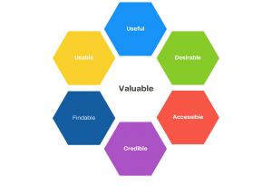
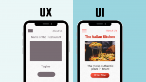
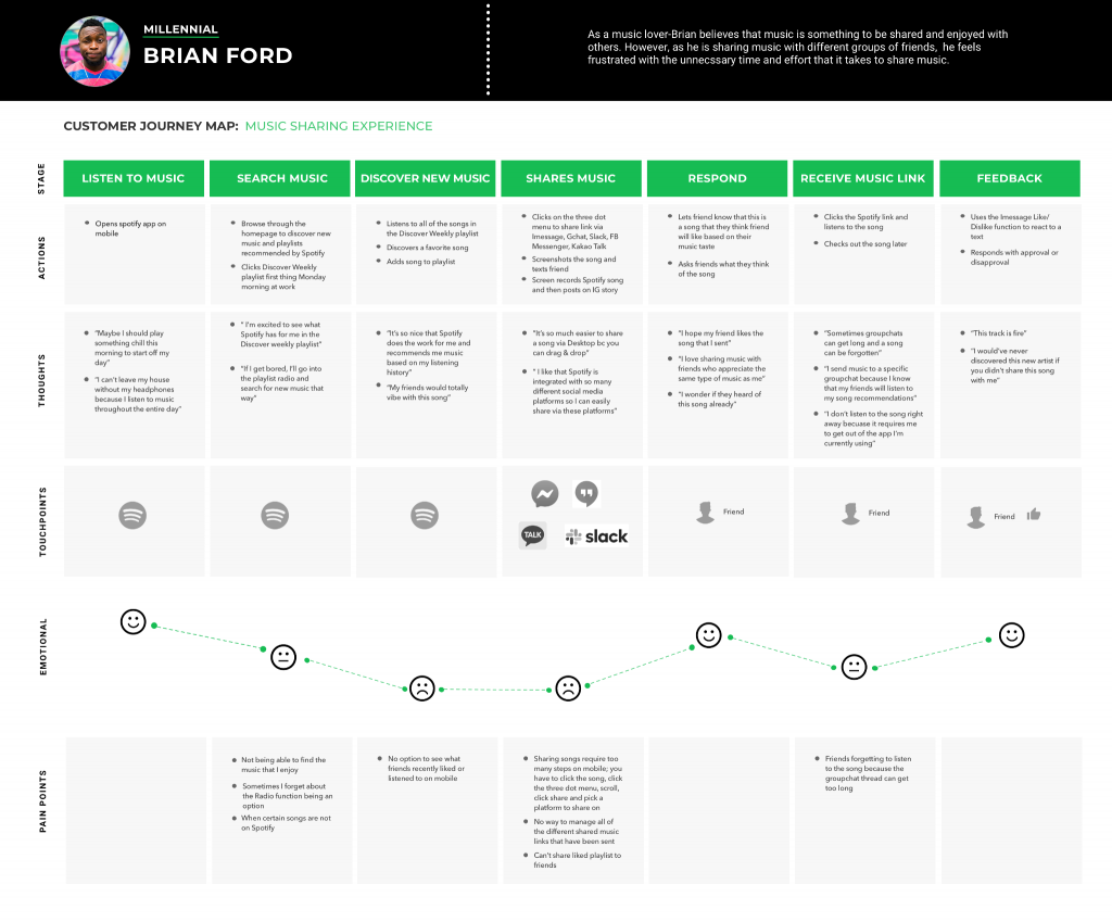
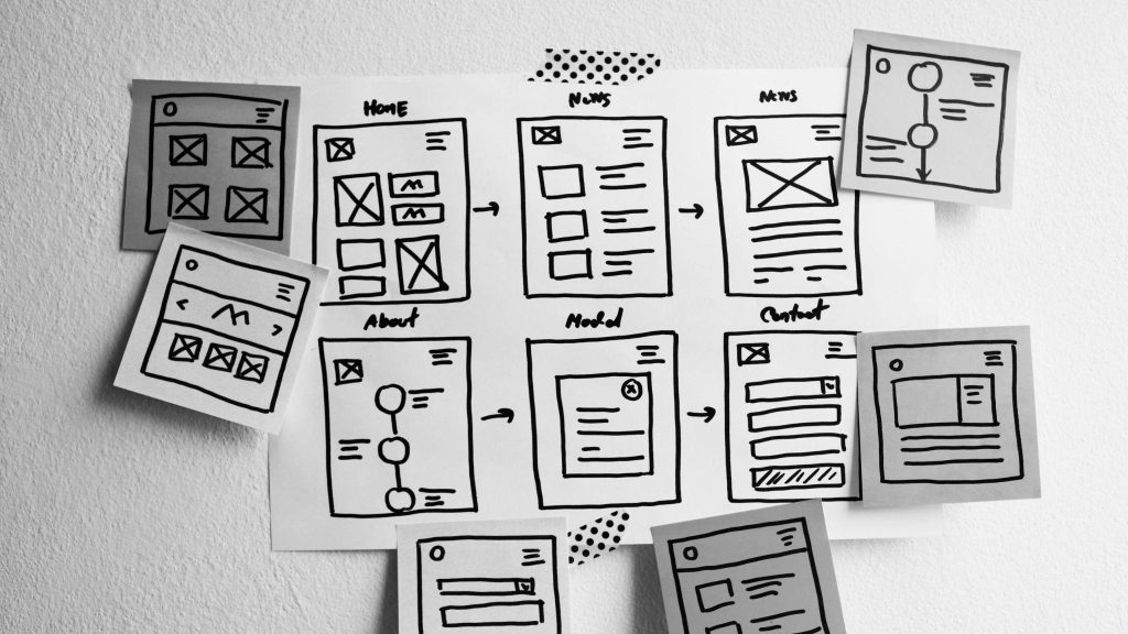
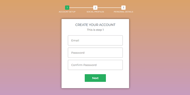
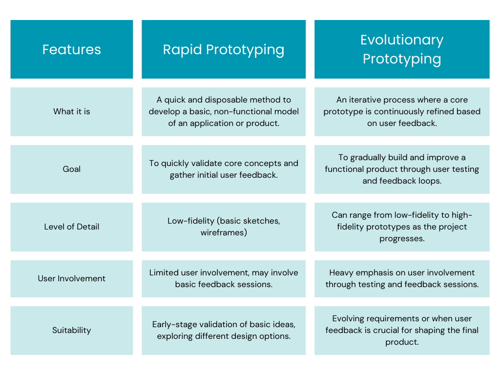
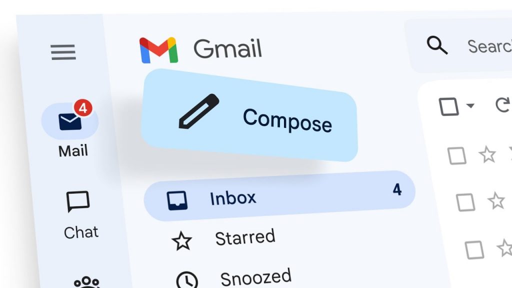
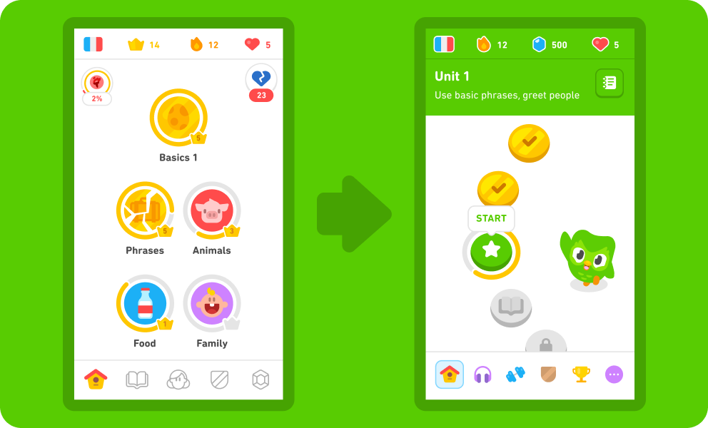
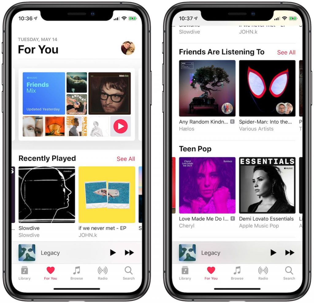
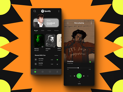
Picture yourself thrilled to try a new app you’ve just downloaded. You launch it, filled with anticipation, ready to dive into its features and discover how it might make your day a bit easier or more enjoyable. However, your excitement quickly turns to frustration. You find yourself navigating through a maze of menus to find simple functions, squinting at tiny text, and struggling to perform even the most basic tasks. Feeling let down, you uninstall the app and look elsewhere. This frustrating experience is far from unique. In fact, research reveals that an overwhelming 77% of users abandon an app within the first three days of use. The usual suspect? Poor user experience (UX) and user interface (UI) design are often to blame. User Experience, or UX, revolves around the complete journey that users undertake while engaging with your app—from their first interaction to the lasting impression it leaves. Imagine a UX designer as a kind and wise guide who meticulously designs the pathway through your app, ensuring that every step is effortless, logical, and enjoyable. Let’s take a look at the Peter Morville’s UX Honeycomb which enlists seven interconnected aspects, each vital for nurturing a delightful user experience: By weaving these seven elements together, your app becomes more than just a tool; it transforms into an experience that users cherish and connect with emotionally, encouraging them to stay engaged and spread the word. UI design is what transforms your app from a bare-bones framework into something that feels like a part of everyday life—beautiful, functional, and incredibly user-friendly.Colors, fonts, buttons, and icons—these elements are more than just decoration. They’re the thoughtful touches that UI designers use to craft spaces that are not just easy to navigate but also inviting. This approach makes the app not just a tool, but a comfortable, intuitive extension of our daily routines. It’s easy to tell apart UX and UI from each other. Think of UX as the brain behind everything, while the UI is the face. UX focuses on what users want to do and makes things enjoyable and easy for them. UI, on the other hand, designs the screens you see and makes them beautiful, clear and visually appealing. If UX is the architect, UI is the interior designer. It’s easy to tell apart UX and UI from each other. Think of UX as the brain behind everything, while the UI is the face. UX focuses on what users want to do and makes things enjoyable and easy for them. UI, on the other hand, designs the screens you see and makes them beautiful, clear and visually appealing. If UX is the architect, UI is the interior designer. First Impression Matters (a lot) In today’s cutthroat app market, making a strong first impression is crucial. It all comes down to having an interface that’s not only easy on the eyes but also user-friendly, with smooth navigation. Just picture this: if an app seems outdated or hard to figure out within the first few seconds, chances are users will ditch it and go for a rival app instead. User Experience = User Engagement When a user-friendly app is well-designed, it can predict what users need and deliver a smooth, hassle-free experience. This leads to happy users who are more likely to spend time using your app, keep coming back, and even recommend it to others. For example, think about a social media app with a slow and clunky interface. It’s frustrating for users and makes them spend less time browsing through content. On the flip side, an app with a fast and user-friendly interface encourages users to spend more time browsing and engaging with the content. Make It Effortless Good navigation is key to a great user experience. No one wants to waste time trying to figure out how to do something in an app. A well-designed interface with easy-to-understand menus, labels, and icons helps users reach their goals smoothly, reducing frustration and saving time. Sell Better Whether e-commerce or just app monetization, apps today are trying to sell something to their users. A well-thought-out UI/UX design strategically places those buttons that prompt action and smoothly leads users through the process of making a purchase. When you create a great user experience, you’re more likely to turn app users into paying customers. Take, for instance, an e-commerce app with a messy product page and a checkout process that’s just plain confusing. Chances are, users will feel frustrated and might give up on buying anything. On the flip side, an app with clear product details, top-notch images, and a straightforward checkout process with secure payment options would motivate users to complete their purchases and even spend a little more while they’re at it. Reduced Costs Investing in good design from the start might seem like spending extra money, but it can actually help you save money in the future. A well-made app that’s easy to use means you need to fix fewer problems and make fewer changes after it’s launched. Plus, when users like your app, they ask for help less often, which means you spend less. Brand Image A user-friendly app creates a positive image of your brand in the minds of users while a poorly designed app with confusing navigation or a cluttered interface can greatly damage brand perception. Good UI/UX design that prioritizes usability and aesthetics positions you as a company that cares about user experience. Thinking Big A well-designed app with a focus on scalability allows for future growth and feature additions.It allows for new functionalities to be seamlessly integrated. This adaptability is crucial for keeping your app relevant and competitive in the ever-evolving mobile landscape. Just like a roadmap helps you navigate a physical journey, a user journey map guides you through the twists and turns of user experience with your app. By plotting out each step, you can spot where things might get bumpy, figure out what users are hoping for, and shape your app to meet those needs. Here is what a customer journey map looks like for a user’s music sharing experience within Spotify: Source: Sharon Kim Wondering how to do it? Here’s the answer: Create User Personas A user persona is like crafting a character for a story, but in this case, it’s a fictional representation of your target audience. Think about the demographics, behaviors, goals, and the challenges your ideal user faces. This deep understanding allows you to customize your user journey map to cater to their specific needs. Look for Key User Journeys Recognize that not every user travels the same path through your app. Pinpoint the essential user journeys that capture the most critical actions users take within your app. This could range from “booking a ride” for a ride-hailing app to “completing a purchase” for an e-commerce platform. Map all Touchpoints Imagine your app as a series of handshakes with your users. From the first glimpse in the app store to the final checkout, every interaction counts. These may include app store listing, onboarding screens, product pages, checkout flow, and even customer support interactions . Understand your User At each touchpoint, try to get into the user’s shoes. What are they trying to do? What’s on their mind as they click through your app? Are they excited, frustrated, or somewhere in between? Understanding their feelings and thoughts helps you design an app experience that truly resonates. Identify Pain Points and Opportunities Think of pain points as potholes in the user’s journey – annoying bumps that slow them down. By spotting these obstacles – whether it’s confusing menus or a buggy checkout process – you uncover golden opportunities to make your app shine brighter. Source: Springboard Set the Canvas Consider the end platform—mobile, web, or desktop—and select a canvas size that matches its screen resolution. For mobile, decide between portrait or landscape orientation based on usage. For web and desktop, aim for flexibility while keeping common screen resolutions in mind. The canvas size should align with your desired user experience and platform. Create a Basic Structure Chalk out your design using boxes or rectangles to represent key UI elements: a header at the top, navigation bar below it, content area as the main rectangle, and a footer at the bottom. This establishes the layout and hierarchy. Place Your Content Right Use placeholder text and shapes to show where images, videos, and text blocks will go. Consider readability and text length limits for a smooth user experience Interactive Elements Use clear labels and basic shapes to represent interactive elements like buttons and dropdown menus in your wireframes. Consider using arrows to indicate interactions that flow between screens. Microinteractions Use simple annotations or visual cues within your static wireframe to represent complex interactions like hover effects or state changes, such as a button becoming disabled. User Annotations Add brief notes or labels to explain specific content details within the wireframe. This can be helpful for understanding the purpose of each element. Consistency is Key Ensure a consistent visual language throughout your wireframes. Use the same kind of shapes and styles for similar elements across different screens to establish a sense of familiarity for users. Do it Differently for Different Devices When designing wireframes for multiple devices like mobile and desktop, prioritize crucial elements on each screen according to user needs and context of use. This ensures a tailored experience for users across different devices. Interested in knowing how to figure out design for multiple devices? Read here. (link to Mobile-First Approach ebook) Hick’s Law Hick’s Law, or the Hick-Hyman Law, is a design principle that suggests the time taken for a person to make a decision increases with the number and complexity of choices available. Essentially, the more options a person has, the longer it takes for them to decide. For instance, when you’re presented with a simple search bar on Amazon, it allows for quick input and reduces the number of initial choices. This application of Hick’s Law helps users find what they need more efficiently. The Goal Gradient Effect The Goal Gradient Effect states that our motivation to achieve a goal increases as we progress closer to its completion. It’s similar to the surge of energy a runner feels when nearing the finish line. In UX design, this effect can be utilized to enhance user engagement and motivation. For example, in an online signup process with a progress bar, as users advance and see their progress, the Goal Gradient Effect encourages them to complete the remaining steps. Source: ByPeople Fitt’s Law Fitts’ Law, a principle in human-computer interaction (HCI), predicts the time it takes for a user to move a cursor or pointer to a target on a screen based on two factors: distance to the target and size of the target: For example, Spotify’s prominent play button at the center of the bottom navigation bar follows Fitts’ Law. Its larger size makes it easier to target, especially on mobile devices, reducing the risk of accidentally tapping the wrong button while aiming to play a song. Miller’s Law Miller’s Law suggests that the average person can hold around 7 (give or take 2) pieces of information in their short-term memory at once. Google’s search results page is a great example of this principle in action. It prioritizes the most relevant results at the top, presenting each with a concise title, snippet, and URL. This allows users to quickly scan and identify potentially useful pages without feeling overwhelmed. Additionally, Google often includes featured snippets or knowledge panels directly on the search results page, further reducing cognitive load and aiding comprehension. Think of UX wireframes as the blueprint for your app—they lay down the foundation, but they’re static. That’s where prototyping steps in. Prototypes are like the live version of your design, adding that interactive element to your wireframes. They allow users to actually experience the flow of your app, testing out its core features and how everything works together. It’s like turning your design into a playable demo, making it easier to fine-tune and perfect before the final product goes live. Within the world of prototyping, there are two main approaches to consider: rapid prototyping and evolutionary prototyping: Wondering how a prototype differs from an MVP and a POC? Read our detailed blog here. Effective UI design principles ensure your app is not only aesthetically pleasing but also intuitive and user-friendly. Here are some of the most important UI design principles to consider: Clarity & Simplicity: Keep your design clear and uncluttered. Users should be able to instantly understand the app’s purpose and core functionalities. The popular social media platform Instagram prioritizes clarity with a clean interface. The focus is on user-generated content (photos and videos) with minimal UI elements that don’t distract from the core experience. Consistency & Familiarity: Maintain consistency in visual style, layout, and interaction patterns throughout the app. Leverage familiar design elements (icons, buttons) to minimize the learning curve for users. The ride-hailing app Uber maintains consistency across its platform. The same icons and functionalities are used consistently across different regions and device types, ensuring a familiar experience for users everywhere. Visual Hierarchy & Balance: Guide users’ attention through the app using visual hierarchy. Prioritize important elements with size, color, and placement. Maintain visual balance for a pleasing aesthetic. The e-commerce giant Amazon utilizes visual hierarchy effectively. Product images and titles are prominent, while less crucial information like filters and sorting options are positioned with less emphasis, guiding users towards product discovery. User Control & Feedback: Empower users with control over their experience. Provide clear feedback mechanisms to acknowledge user actions and interactions. The photo editing app Adobe Lightroom Mobile offers users granular control over photo adjustments. Sliders and editing tools are readily accessible, and the app provides real-time previews to reflect editing choices, giving users full control over the creative process. Structure Principle Organize the UI elements in a meaningful and purposeful way. Related elements should be grouped together, unrelated elements should be separated, and visual cues should be used to differentiate between different functionalities. The email app Gmail embodies the Structure Principle. Emails are threaded by conversation, important actions like “Compose” and “Reply” are prominently placed, and folders and labels are categorized logically, creating a well-structured interface that helps users manage their inbox efficiently. Source:The Keyword Accessibility & Inclusivity: Design your app to be accessible to a diverse range of users, including those with visual impairments, motor limitations, or cognitive differences. The video-sharing platform YouTube prioritizes accessibility. Closed captions and audio descriptions are available for videos, and the interface can be adjusted for different color contrast needs, ensuring an inclusive experience for all users. Usability testing involves observing real users interact with your app and identifying any potential roadblocks that hinder their experience. Here’re some tools to get you started: 1. Screen Recording Tools Capture video recordings of user sessions, allowing you to observe how users navigate the app, interact with elements, and complete tasks. 2. Remote Testing Platforms Users can interact with your app from their own devices while you observe and collect data. 3. User Feedback Tools: Gather qualitative data from users after they interact with your app. They can include surveys, polls, and in-app feedback mechanisms. 4. Eye-Tracking Software: Tracks users’ eye movements as they interact with the app, revealing which elements capture their attention and where they might be experiencing confusion. Voice User Interfaces (VUIs) Gone are the days of endlessly tapping through menus. Voice User Interfaces (VUIs) are becoming increasingly sophisticated, allowing users to interact with apps using natural language and enabling a hands-free experience. Imagine that you’re running late for work and craving your usual caffeine fix. With the Starbucks app’s voice ordering feature powered by Siri or Google Assistant, you can simply say “Hey Siri, order me a grande caramel macchiato at the nearest Starbucks with my usual customizations” and your order will be placed without needing to open the app or type a single word. Fast, convenient, and perfect for busy mornings! Source: The Wall Street Journal Augmented Reality (AR) AR is transforming how we interact with the digital world. Ever wished you could see how a new couch or bookshelf would look in your living room before you buy it? The IKEA Place app leverages AR to address this very concern. Using your smartphone camera, the app allows you to virtually place IKEA furniture models in your space, letting you visualize scale, style, and fit before making a purchase. This AR-powered feature eliminates the guesswork and uncertainty associated with online furniture shopping, making the decision-making process smoother and more confident. Source: Architect Magazine Microinteractions Microinteractions are tiny animations and feedback cues that acknowledge user actions and guide them through the app’s functionalities. Learning a new language can feel daunting, but Duolingo’s gamified approach makes it engaging and fun. The app incorporates delightful microinteractions throughout the learning process. For example, completing a lesson is rewarded with a satisfying animation and encouraging messages. Duolingo also uses microinteractions to highlight correct answers and gently nudge users towards the right response if they make a mistake. These subtle cues keep users motivated and provide a sense of accomplishment as they progress through their language learning journey. Source: Duolingo Blog Neomorphism and Glassmorphism Neomorphism utilizes soft shadows and subtle 3D effects to create a sense of depth and dimension, offering a clean and modern aesthetic. Apple Music embraces neomorphism with its clean interface and use of subtle shadows. Buttons and UI elements appear slightly raised, offering a sense of depth without looking overly complex. This design approach complements the app’s focus on music discovery and playback, creating a visually appealing and user-friendly experience. Source: MacRumors Glassmorphism, on the other hand, emphasizes transparency and blurred elements, resulting in a lighter and more ethereal feel. Spotify leans towards glassmorphism with its use of translucent elements and blurred backgrounds. This approach creates a lighter and more modern feel, allowing album covers and other visual content to take center stage. The subtle transparency also helps maintain a sense of hierarchy within the interface, ensuring important information remains clear and easy to access. Source: Dribbble
But there’s hope! This guide is your entry into the essential world of UI/UX design for mobile apps. So read on to know how you can create a mobile app that users not only download but truly enjoy and keep using.What is UX?
What is UI?
UX and UI: What’s the difference?
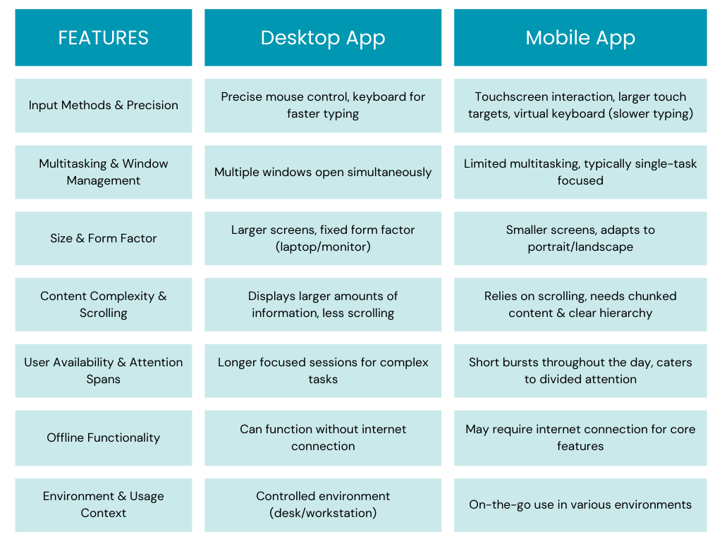
Desktop Vs. Mobile App: How the UX Differs
Why UI/UX Design Matters in Mobile App Development
The ‘How’ of UI/UX Design for Mobile Apps: Step-by-Step
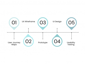
Step 1: Mapping User Journeys
Step 2: Building UX Wireframe
Step 3: Prototyping
Step 4: UI Design
Step 5:Usability Testing
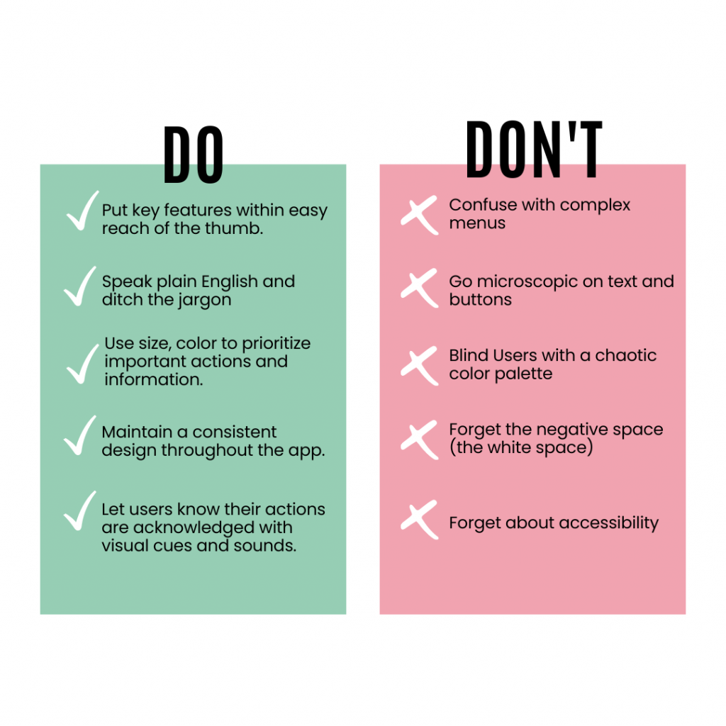
The Do’s and Don’ts of Mobile App UI/UX
Trends to Watch Out for in 2024


Excited about your mobile app design? Kickstart your UI/UX journey today by reaching out to us at hi@logicloom.in
References